Part 1 - Creating Letterforms
This week's brief is to create our own distinct typefaces from absolutely anything. The letters can be portrayed straightforwardly or in an abstract manner. There are no restrictions appearance-wise, so the possibilities are endless! I decided to start off by looking for letters in the environment around me (the university campus area).
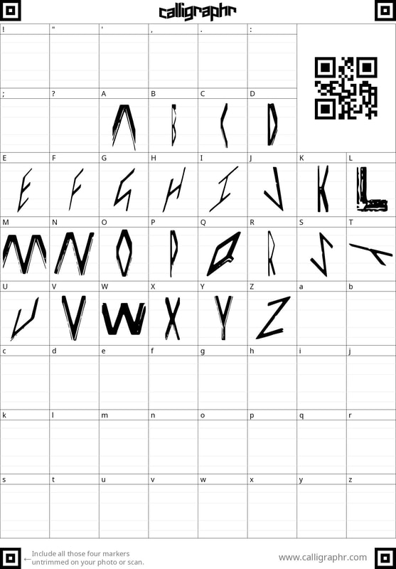
Found Typography
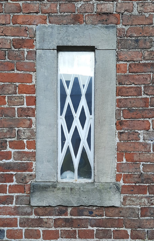
I was able to perceive quite a few letters in the areas above, but unexpectedly, this latticed window had the entire alphabet. In this final line-up, I have rotated some so that the letters are more legible and because most of the letters were already upright.
|

|

A method I was eager to experiment with was producing type through poses. However, as I wasn't sure where to begin, I decided to sketch out some potential poses to try out before photographing any poses since this would quicken the whole process for me.
Myself
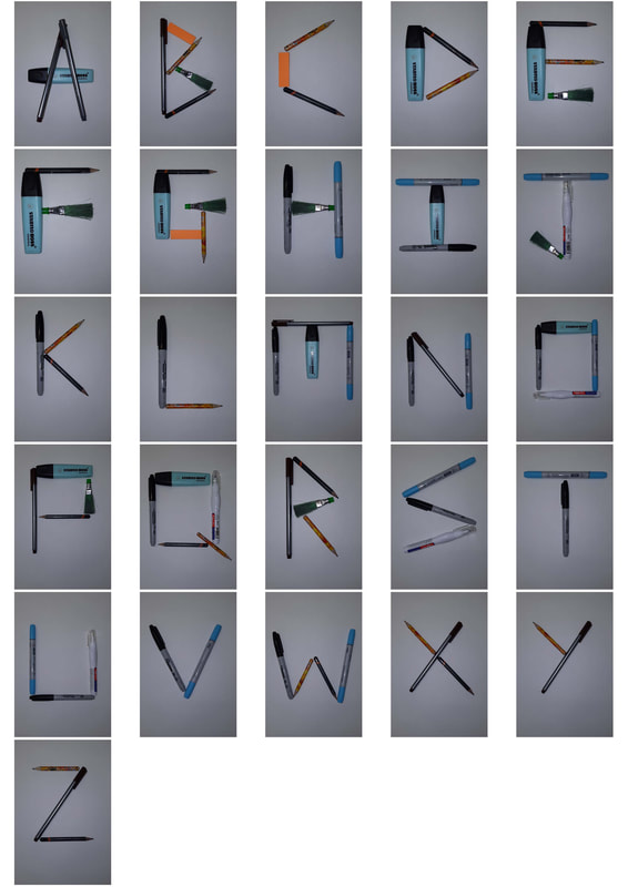
I tried out some of my prepared ideas, as well as some that only emerged after posing for a while. This was as enjoyable as it was challenging. Personally, I really like my 'A' pose. Also, I went for a smaller 'X' because I thought it would look more accurate than the star-like 'X' pose.
Tea Towel
I tried some lowercase letters here since I had only been considering the strongly structured capitals.
Lollipop Sticks
There has been numerous rigid capitals already, so I tried a looser approach and aimed for a more abstract appearance by simply shaking and tossing the lollipop sticks several times until I could perceive any implication of a letter. For some compositions, I removed sticks for a more minimalistic style.
Rubber Bands
My approach with the rubber bands was influenced by some tutor feedback and being shown some examples of pushing the boundaries of type. I placed the bands down in random and illogical ways to start off, before making some slight changes to create a vague interpretation of the chosen letters.
Lollipop Sticks & Rubber Bands
This is further exploration of abstract letterforms and this time, I combined two of my materials since both were of small quantities and I hadn't tried mixing my collections of stuff yet either.
Seashells
As there were only two seashells, I naturally had to be more careful, precise and subtle with the arrangements. Personally, I think my B is quite clever.
Book Binding String
Interestingly, the end of the string was stubbornly bent, but this was not bothersome at all as it gives my characters some... character.
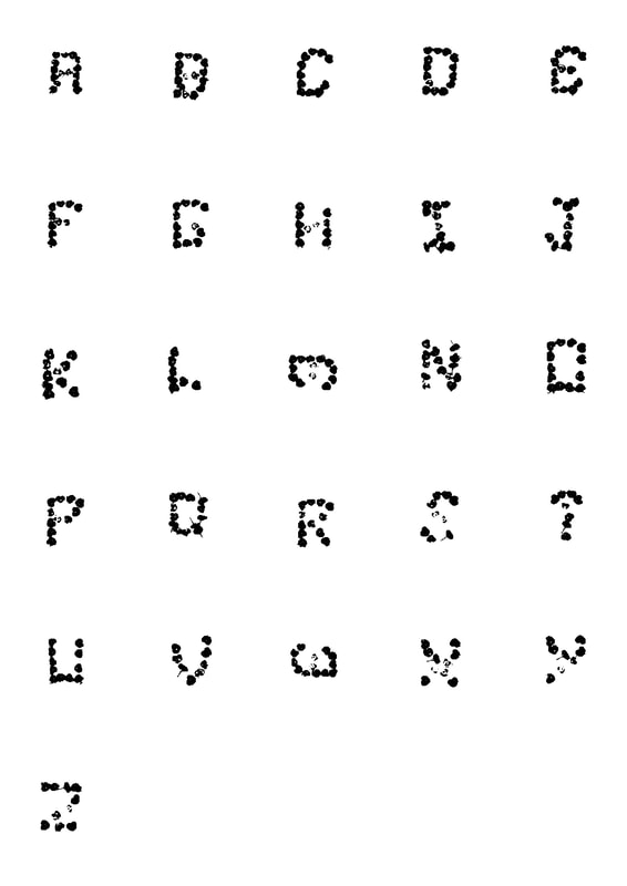
Complete Letterforms
|
|
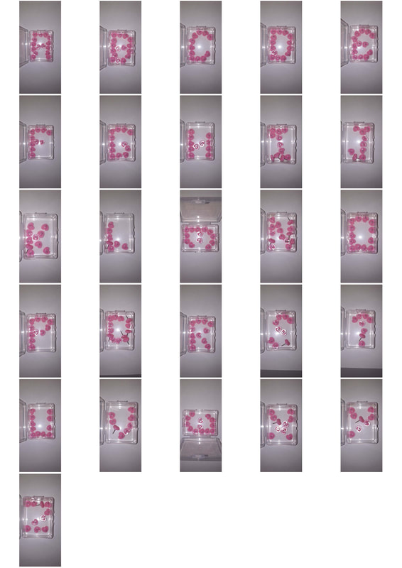
These are heart-shaped push pins in their storage container. The final outcome has an intriguing children's arts and crafts feel to it. I kept the pins inside the container because I wanted something to hold the composition together since I was arranging the pins quite loosely.
|
|

|
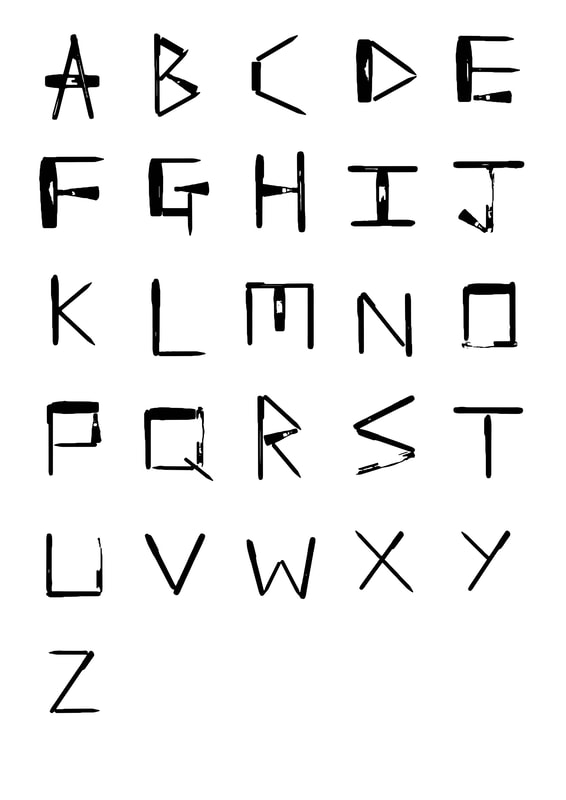
The left image is from the window photograph I took. Fiddling with the Image Trace settings on Adobe Illustrator allowed me to maintain that unique quality of the ridges of the window lattice. The overall appearance feels quite sleek and fun. I also like the contrast between the stroke thickness of some letters. Varying thickness in letters would usually be difficult for the eye to continuously read, but for design text, it's fine.
|
|
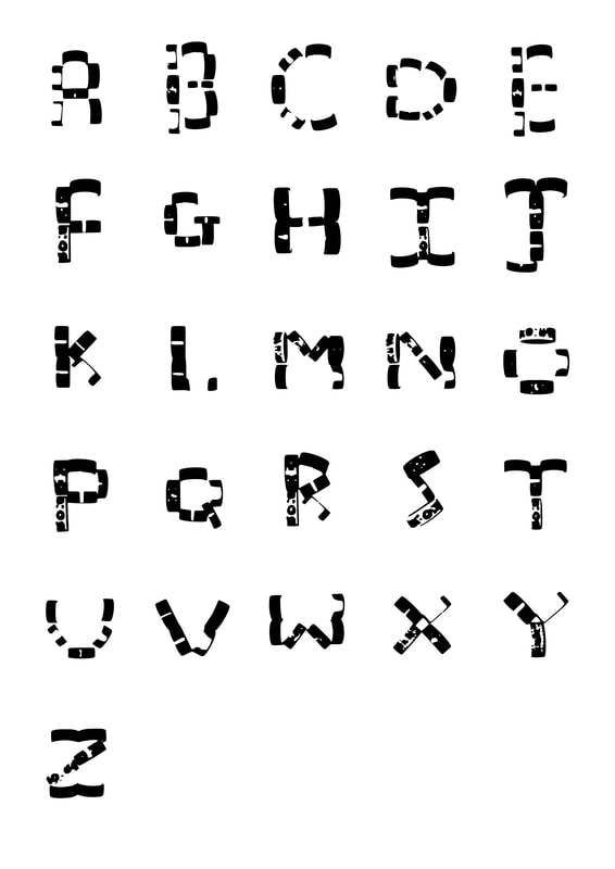
Somehow, I feel that the black and white typography version looks a lot more exciting and dynamic than the full colour photos. The inclusion of the brush head (I use it to sweep rubber shavings) in this set of stationery was definitely the right choice. Along with the distinct shape of that highlighter, the overall effect is quite visually pleasing to me. Here, I learnt just how different work can look with just a small change.
|
|
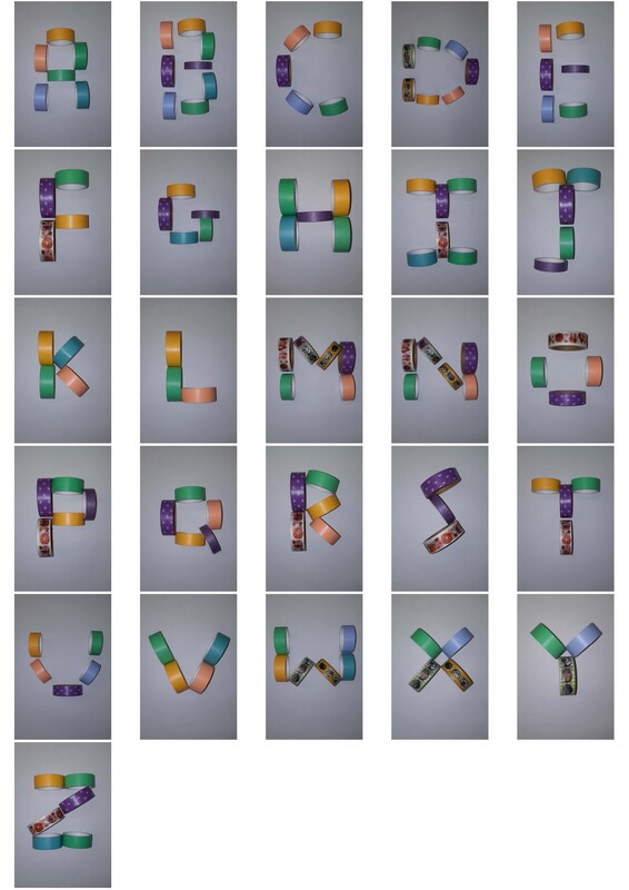
The combination of flash photography and patterned tape has enabled for a striking appearance in the final outcome. This looks even more playful than the photos of my decorative tape (also known as washi tape).
Part 2 - Let's Get Digital
For week two, we will be turning our letterforms into usable fonts, which will then be featured on a set of black and white (or greyscale) posters. One will be to showcase the typeface, so every letter in the alphabet has to be displayed and the other will be about the process used to create said typeface.
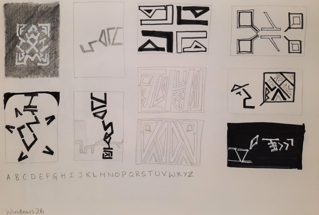
Using Calligraphr, one of many online tools for creating your own typefaces, I successfully digitised my window frame typeface, aka Windows 26.

Since the inclusion of the full alphabet did not have to be in alphabetical order, I chose some relevant pangrams I could use instead. Below, I explored various shapes and formations that implied 'window'.
I tried to illustrate a jumping zebra using my letters for the 'How vexingly quick daft zebras jump!' pangram. This was experimented with because the zebra could jump through a window, as a casual inclusion of narrative and connection with the theme.
Thumbnail Ideas for Poster 1

For this poster, I tried all sorts of different kinds of windows since it would be a strong indicator of what my typeface came from and to tie in with the name, which was also included in the compositions. Towards the end, I noticed how my K's bore a striking resemblance to curtains (lovingly dubbed K-urtains by a tutor) and I was quite taken with the idea.
Posters for Poster 1
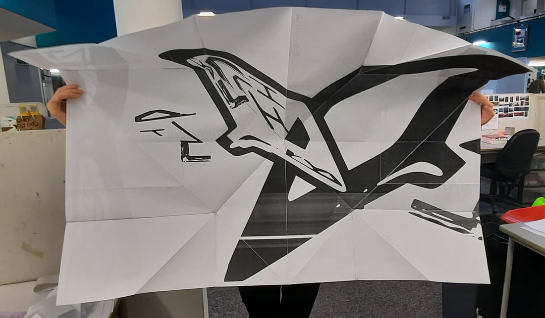
The digitisations of the ideas were transferred as is, except for the first idea I did. I decided on the addition of the frame made up of a repetition of the font name Windows26 in order to enhance the one-point perspective that had emerged unintentionally. Now that I see the design again, the window bears a stronger resemblance to a set of double doors.
Process for the first candidate for Poster 1
I changed the pyramid formation of the alphabet to the shape of a human silhouette, since that would show the letters as a shadow in the light more clearly.
Posters for Poster 2
The general concept with these was to see what images I could form using my font, with a loose theme of windows in mind. Some scenes were based on what could be seen if one happened to peer into a random window. I also tried some possible patterns for the window panes and frames.
Posters for Poster 2
For the third candidate for Poster 2, I added the suggestion of another person speaking. Since someone was already speaking (saying 'blah blah blah', in fact), I decided it was best not to add speech to the second speech bubble. It also provides contrast to the first bubble. This second bubble also makes it more obvious that the L at the edge of the composition is an open mouth.
The conversation was chosen for this idea since it encapsulates my process for the creation of the font. I formed the idea for my typeface through talking to other people and also myself.
The conversation was chosen for this idea since it encapsulates my process for the creation of the font. I formed the idea for my typeface through talking to other people and also myself.
Part 3 - Posters? What Posters?
Photocopier Experiments
One of these A4 posters are double-sided, with the two designs on each side. Superimposing them on top of each other makes it appear as if the viewer is peering into the window and seeing/hearing people having a conversation. It simultaneously ties Poster 2 closer to the theme and adds more of a narrative to the piece.
Zine Production
This set was folded and cut when following a tutor's demonstration. These basic techniques were a great starting point for creating zines using our posters. Our task for this session was to fold a zine using a double-sided A0 poster.
Following the tutorials above, I tried out the Turkish map fold on both square and rectangular paper.
The Final Zine
Front
Back
The Turkish map fold was a lot more challenging with A0 paper, but I managed, thanks to all the practice I had beforehand.
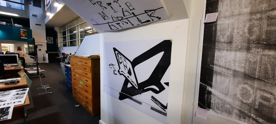
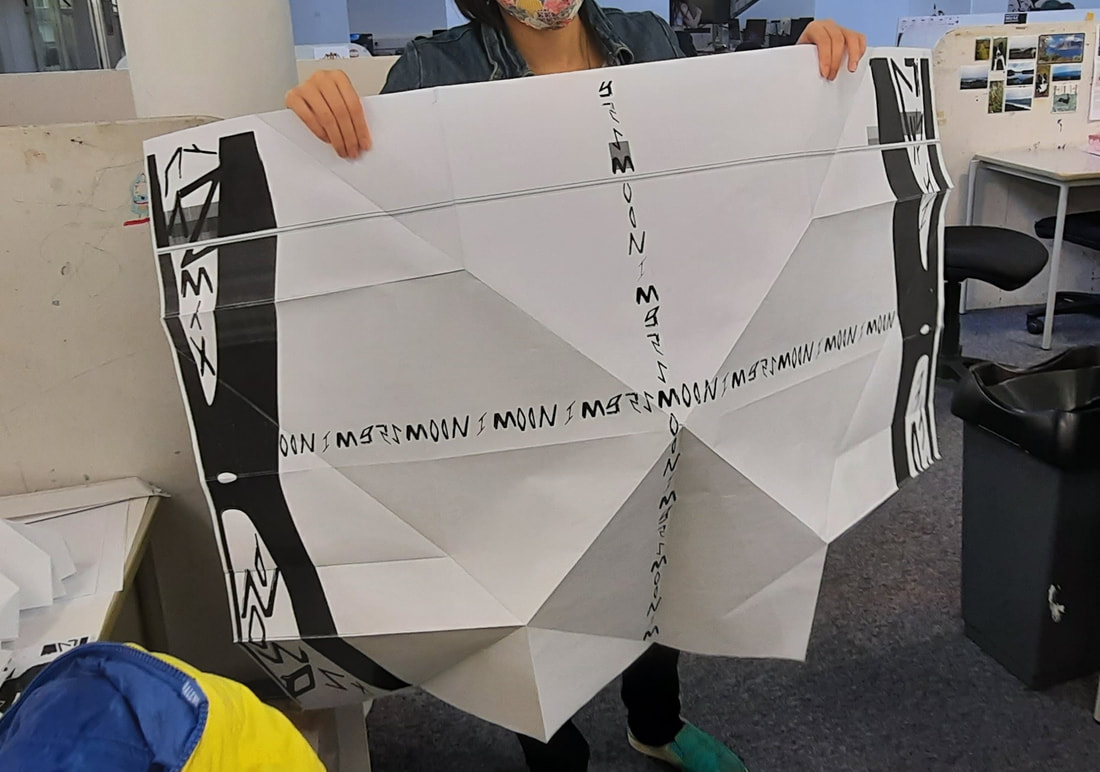
Below is Poster 2 up on the wall for this project's feedback session.
Below is Poster 2 up on the wall for this project's feedback session.