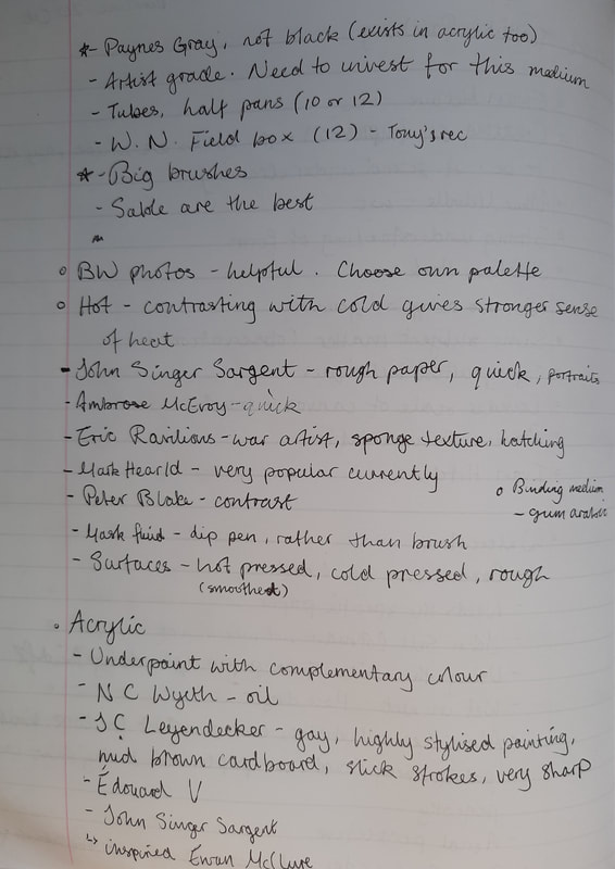
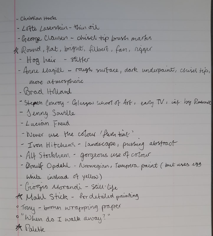
Week 1 - Black and White
|
Lecture notes
|
|


Artist research
|
Andrew Tan
|
Mick Marston
|
|
|
|


|
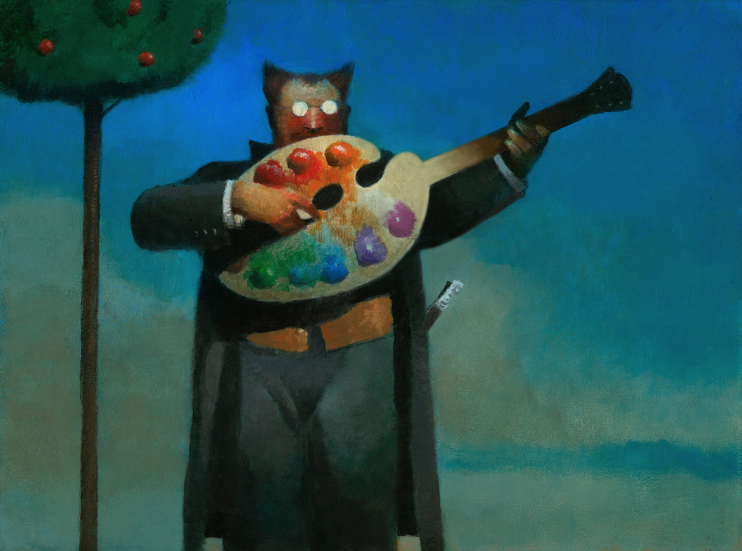
Brad Holland
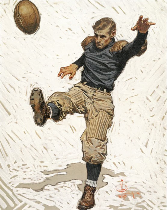
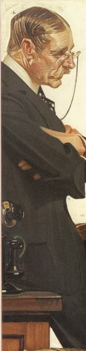
J. C. Leyendecker
|
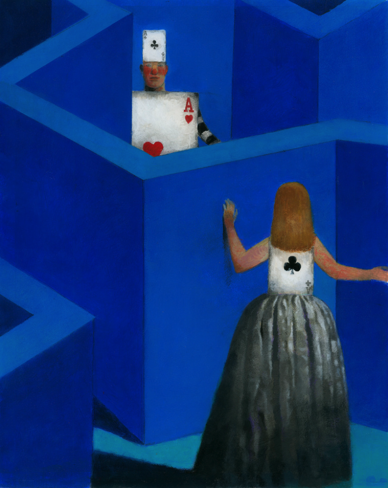
Brian Sanders
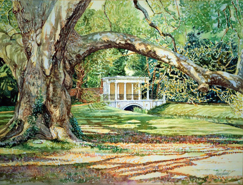
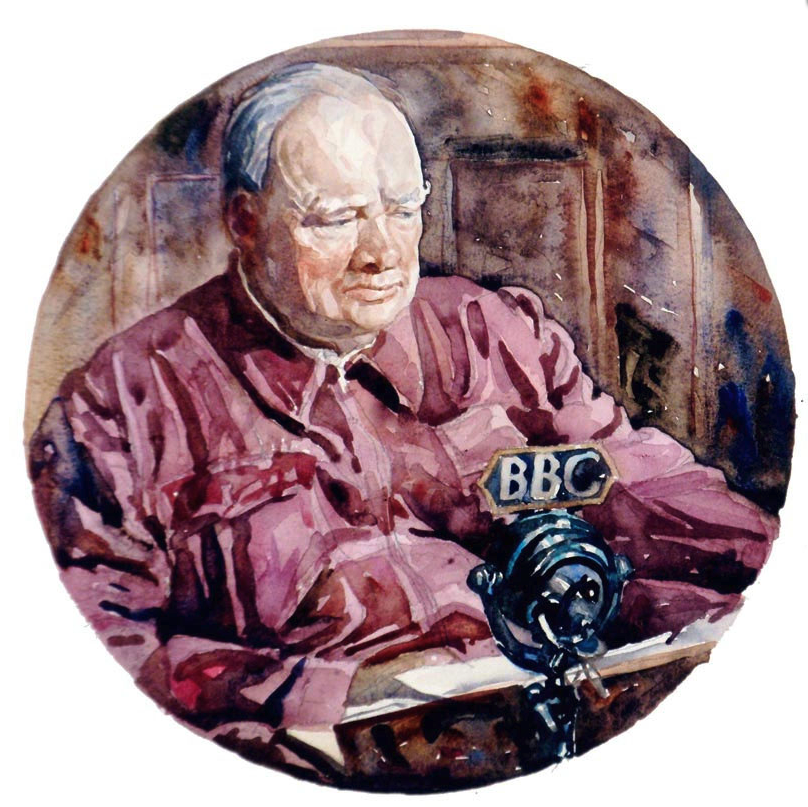
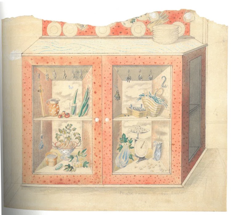
Eric Ravilious
|


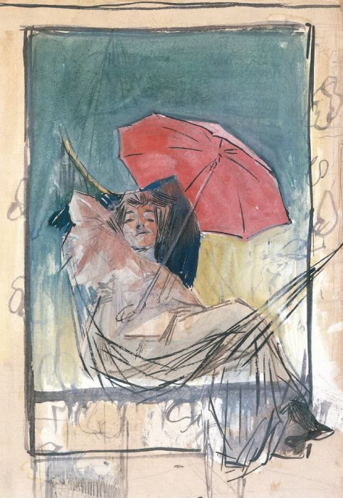
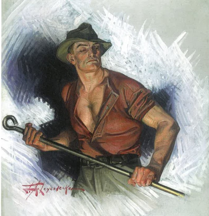

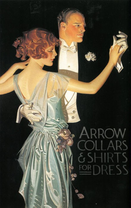
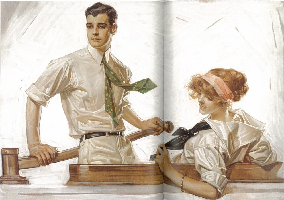

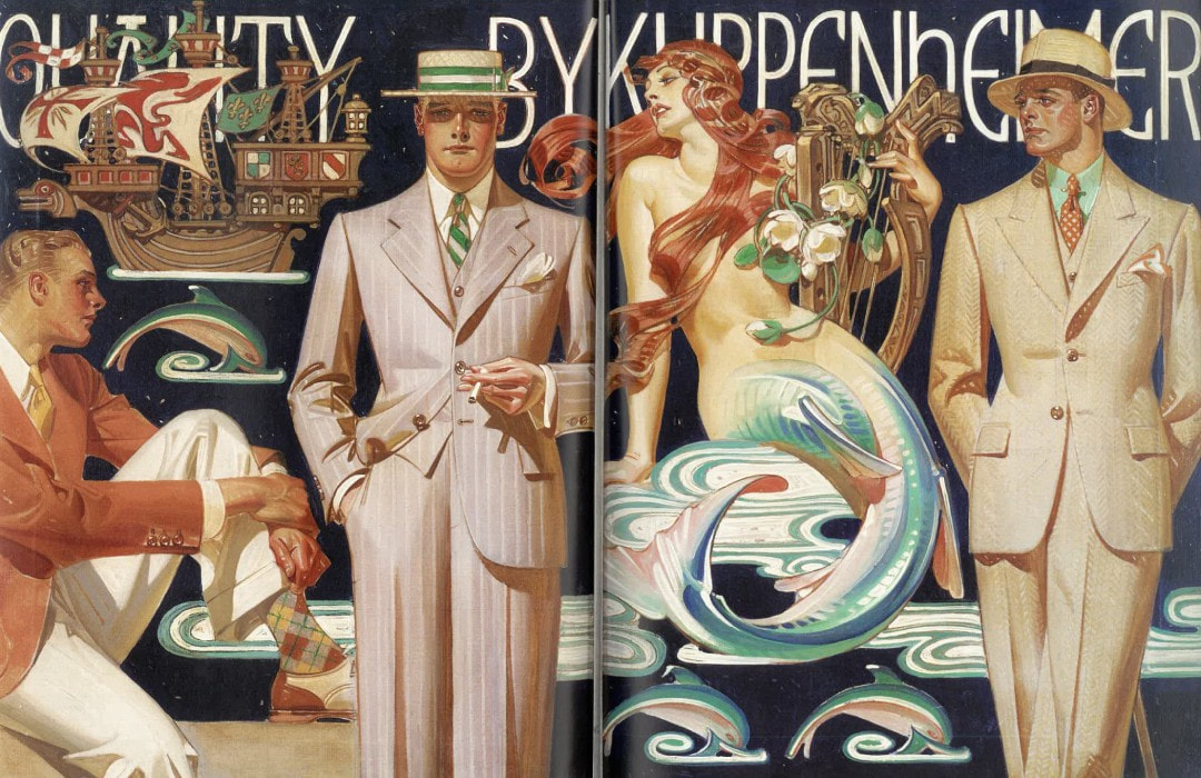


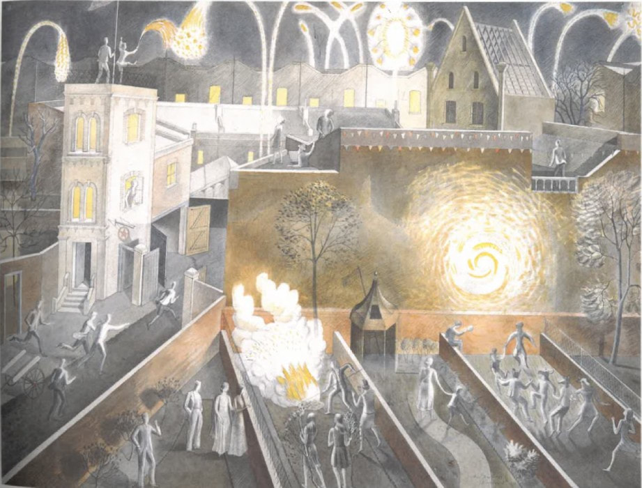
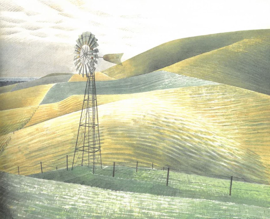

For each task, I looked at various artists' work. I examined Leyendecker and Ravilious' work in the most detail as I tried to follow the techniques I could pick out from their pieces. For example, Leyendecker's precise brush strokes and Ravilious' use of sponge and hatching to create texture in his watercolour art.
Books and tutorials
|
|
|
|
|
|
|
My work
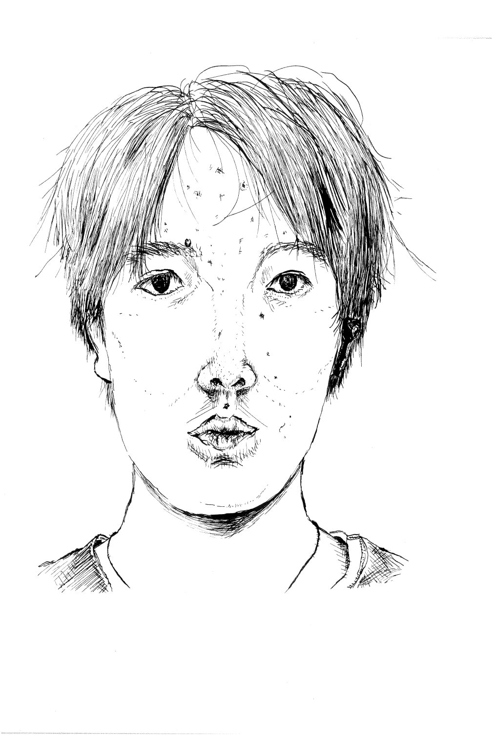

These were done in dip pen. I tried to control the pressure of the pen the best I could to avoid any ink mishaps and scratching the paper. The sound it makes when that happens isn't desirable either. To ensure a smooth application of the ink, I tested the lines on scrap paper whenever I dipped into my Quink ink. This approach kept me safe this time and I am rather pleased with the results of both my portrait and still-life. For both pieces, I went straight in with the ink. In hindsight, my face ended up more elongated than it is in real life and the foldable ruler could do with some tweaking, so I should have done pencil first. Despite this, I am proud that I tried out freehand drawing with the dip pen.
|
|
|

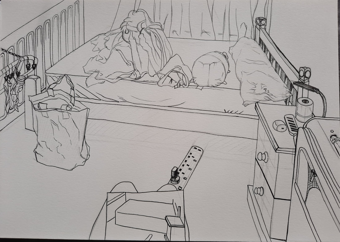

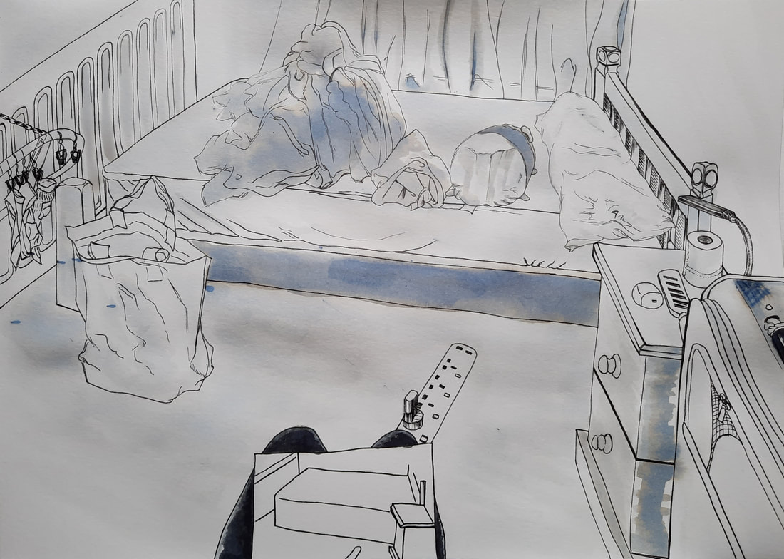
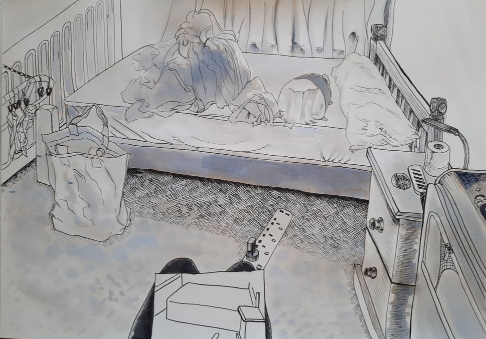
For the Drawing module, I observed Paul Heaston's work, which led me to add an ink wash to this room artwork. I discovered immediately that he definitely does not use Quink ink for his ink wash, but it has caused some interesting effects that I enjoy. I added hatching on top of some ink washed areas in order to emphasise a darker tone, show texture and create more contrast within the composition. I think the perspective looks quite alright here, though I could possibly scale up some of the closer objects.
Week 2 - 3D
|
Lecture notes
|
|
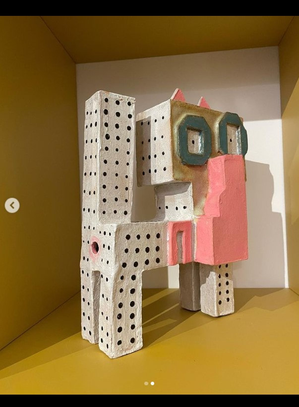
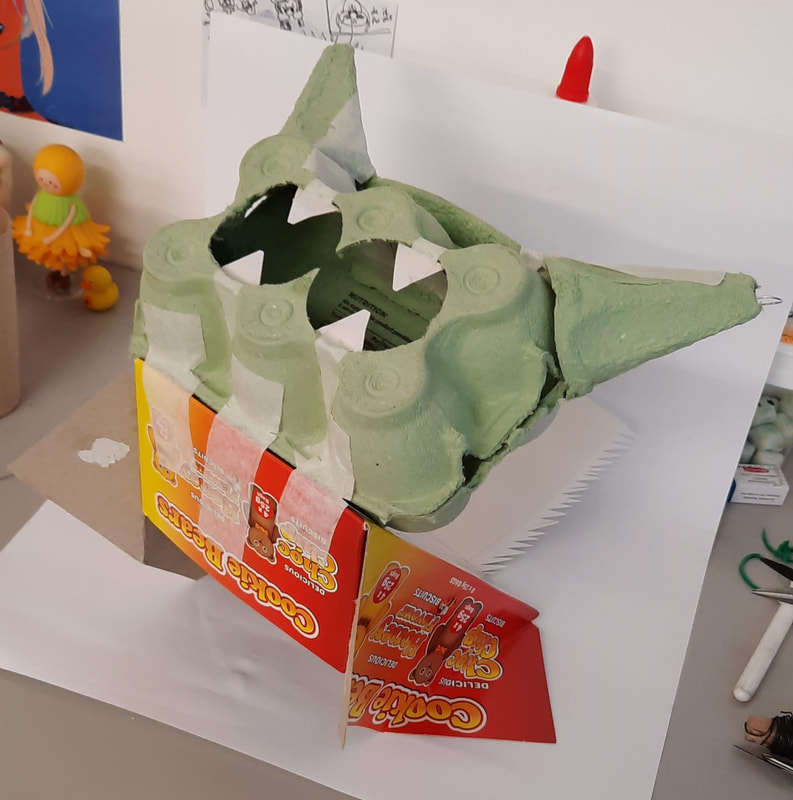
Dog/cat production
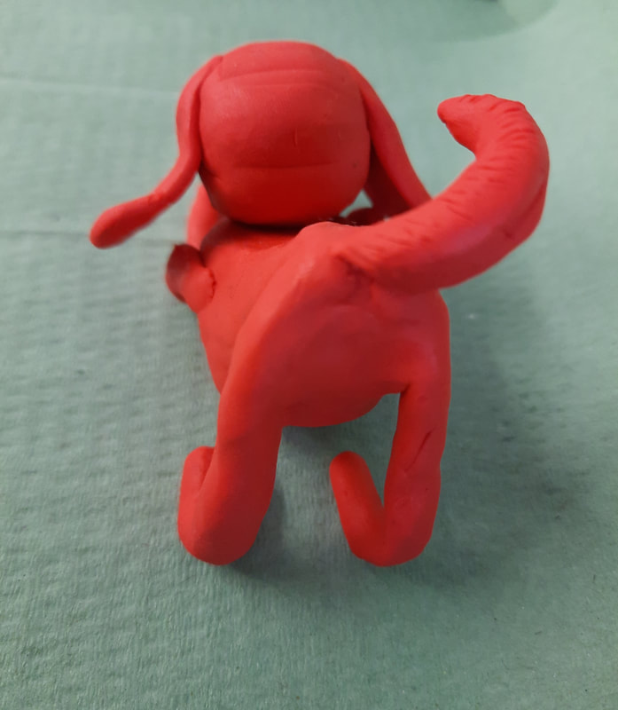
To start us off, we were given 30 minutes during a studio session to make either a dog or a cat out of the special selection of plasticine. As our main aim was to capture the essence of the our chosen animal, I picked this playful tail wagging pose. In addition, I chose this bright pillar box red plasticine because it reminded me of Clifford the Big Red Dog. Though the legs may be of questionable likeness, at least it's clear how the dog is feeling. This is a success in my books.
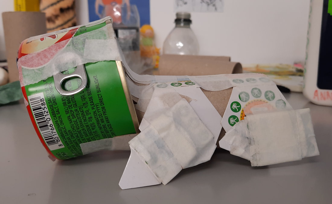
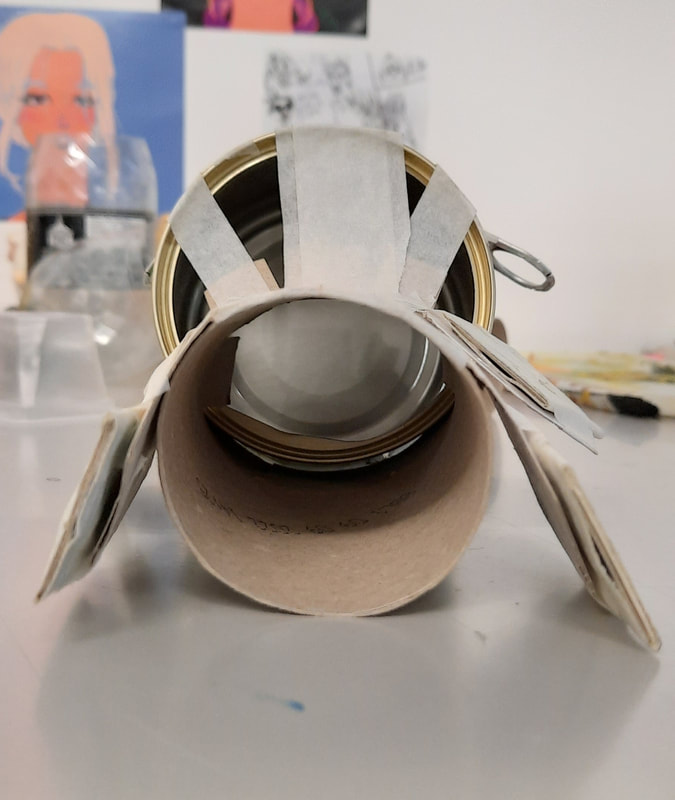
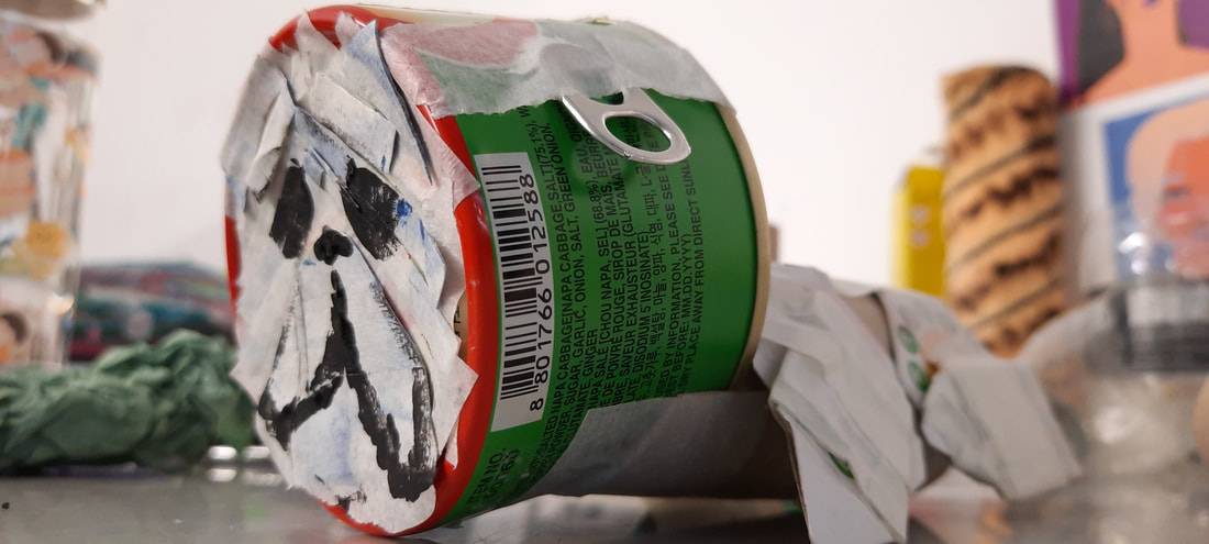
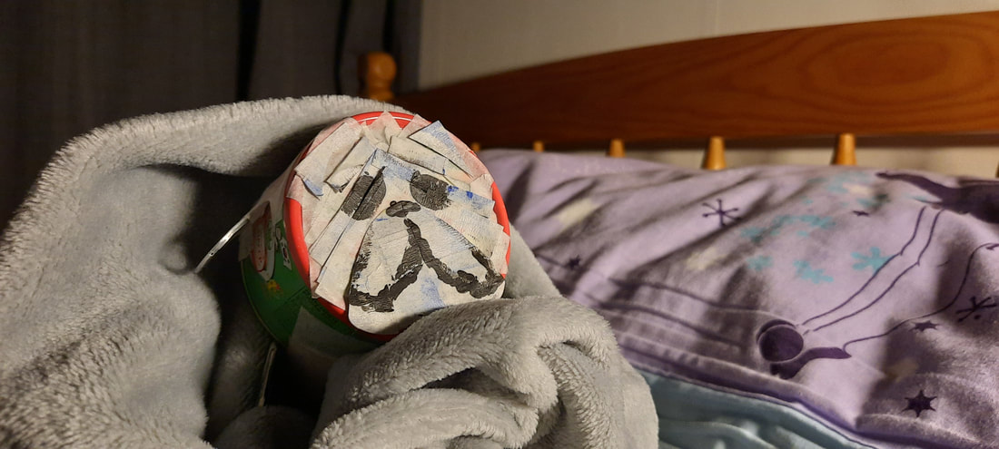
Clyde the Little Red Dog


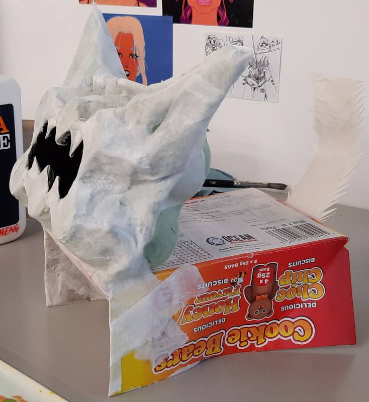
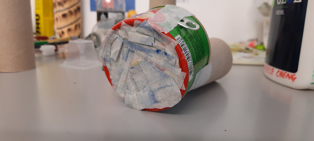
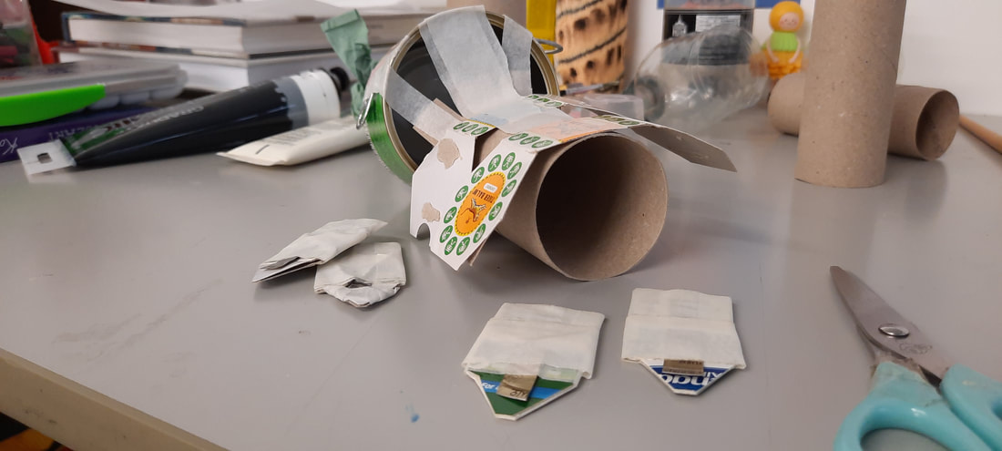
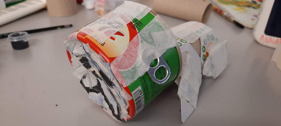
In preparation for this week's task, I piled my recycling high and it paid off massively. Although one issue is the fact that I had a lot to sift through and choose from. It definitely ate up half of the first day of work.
Ferrero Roar-cher the Bengal Cat


|
This was the outcome of the photoshoot for the final shot of my ferocious cat. Although I soon ran out of ideas for poses, I feel like I caught some dynamic angles.
|


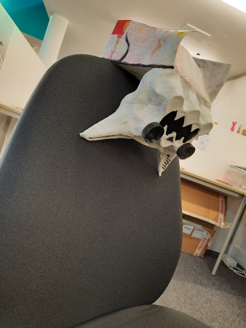


Puckleberry Finn
|
|
|


I managed to form some of the distinct pug wrinkles with the masking tape, but that wasn't clear enough for me so I finger painted the face with some acrylic.
And now for Huggleberry Finn:

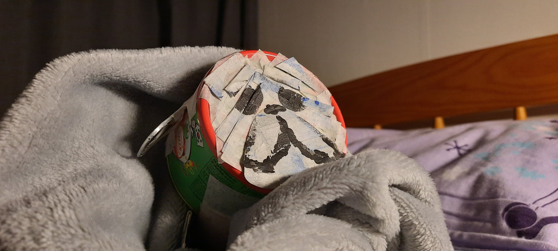

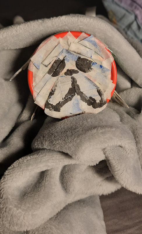
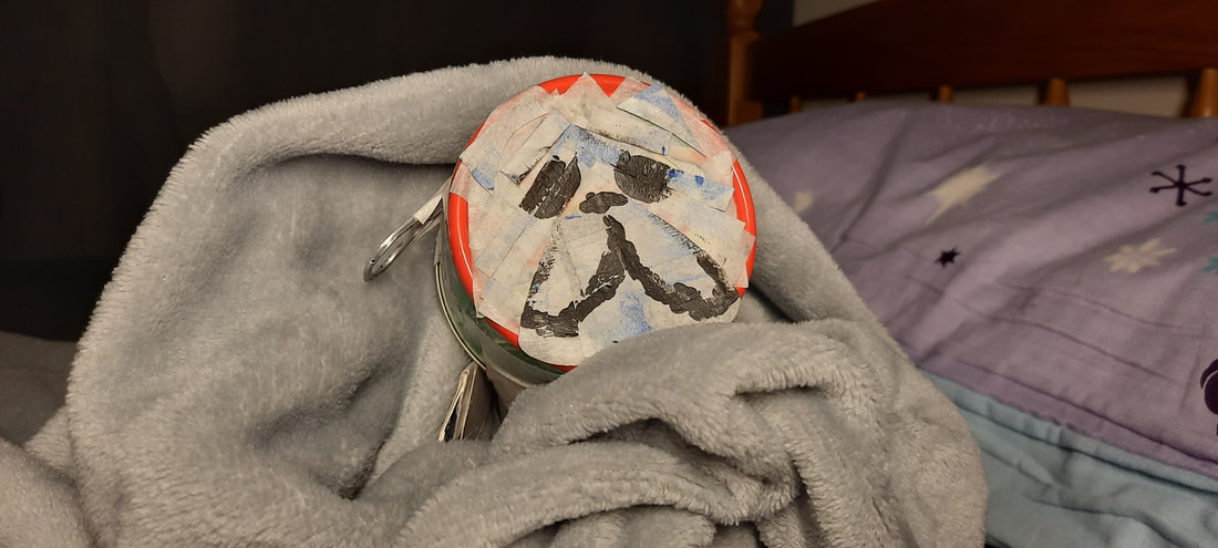


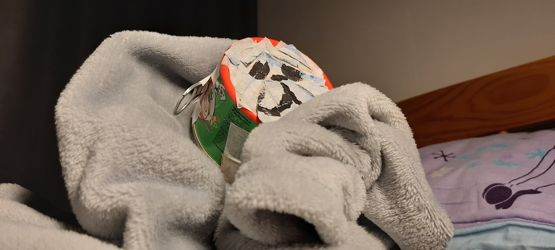
For the final photoshoot, I thought the perfect prop for this incredibly sad Puggleberry Finn would be a cosy blanket. I used my desk lamp for some bright, but warm lighting. This set of photos are definitely more successful than the previous cat photoshoot because there's a bit of atmosphere present now. I believe this is down to the stronger lighting.

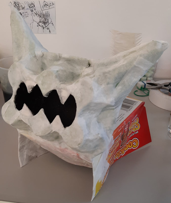
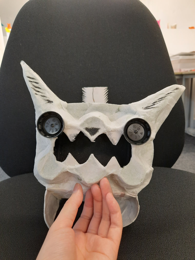
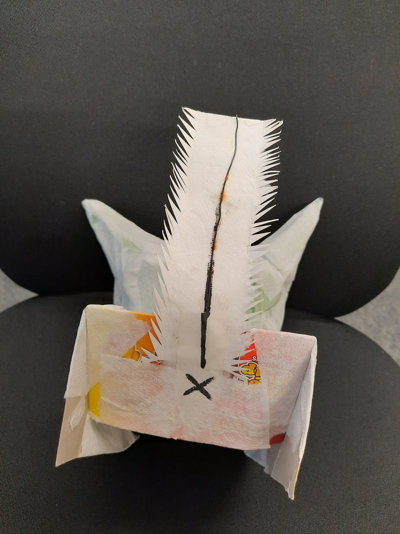
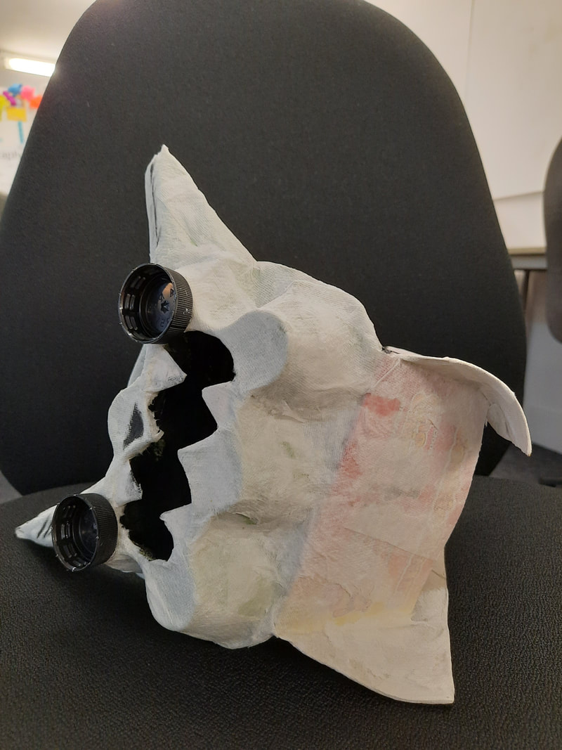
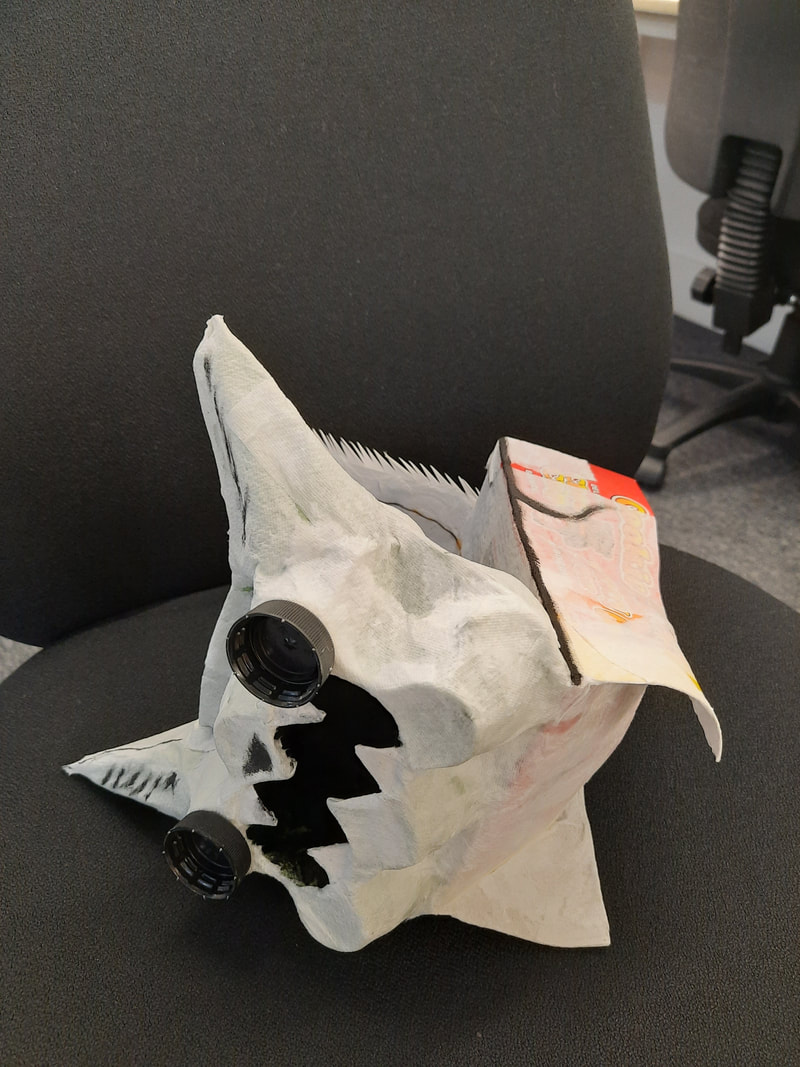
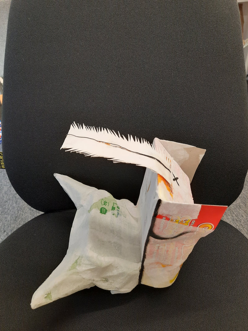
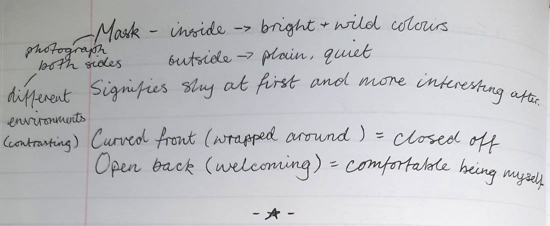
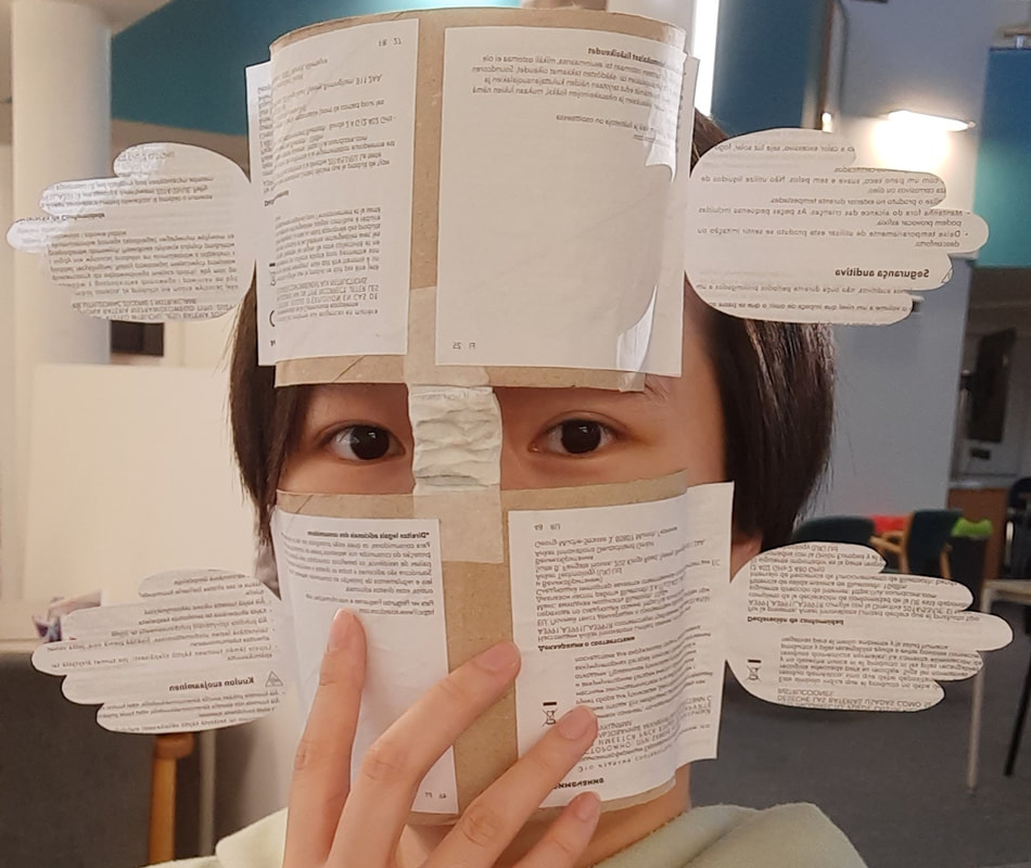
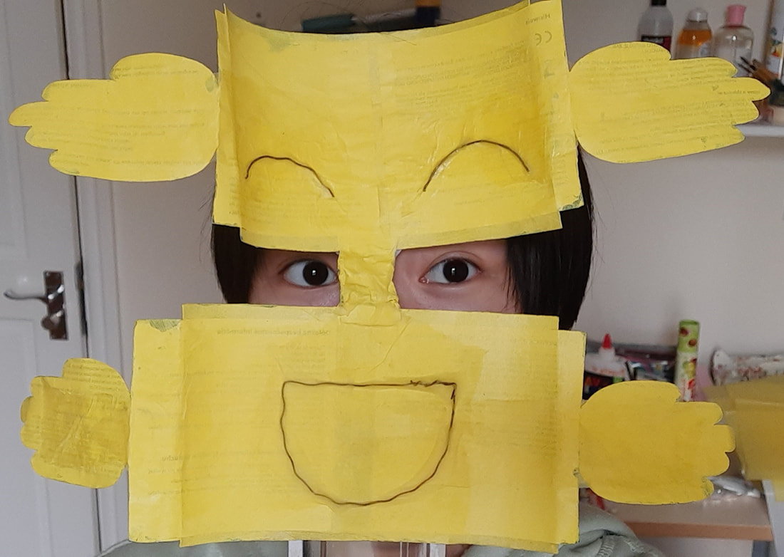
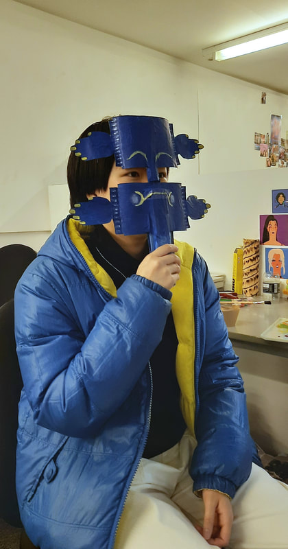
Mask
|
There are two decorated sides of my mask because I wanted to portray that how I present outside, may not be anything like how I am on the inside. A shy, reserved and somewhat gloomy exterior versus an easily excited and positive interior. Colour-wise, I was inspired by the coat I wear the most.
|
Process

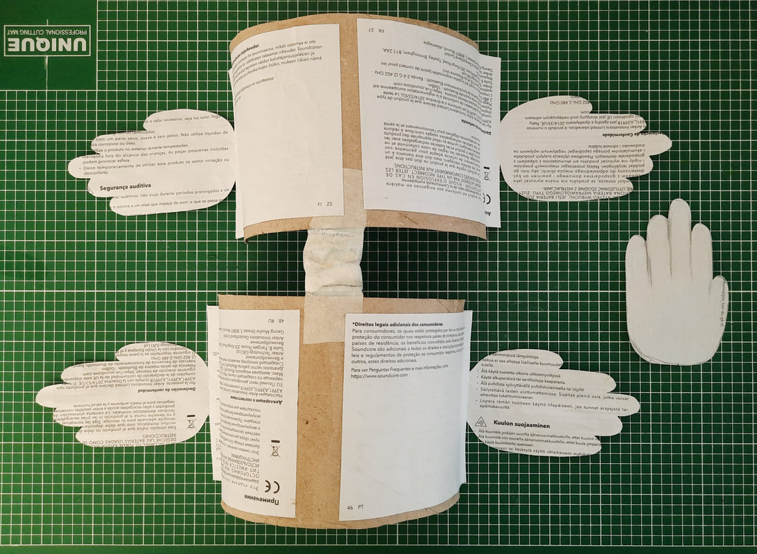


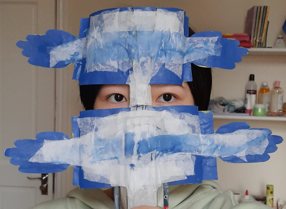
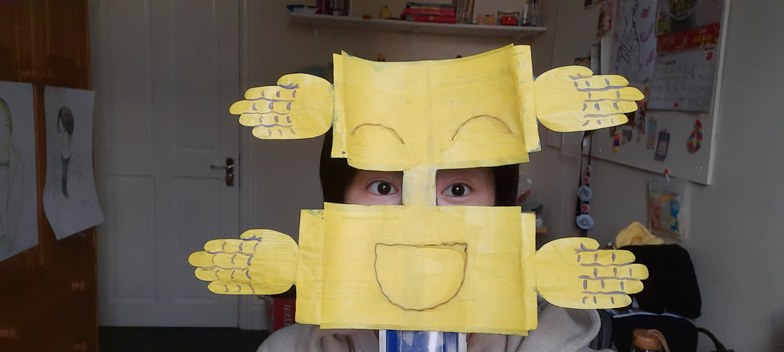
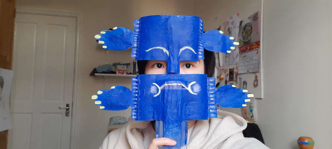
To achieve this shape, I played around with my scrap materials in an approach familiar to Mick Marston. Eventually I thought of the idea with hands to indicate my closed-off side and welcoming side more clearly. The addition of a handle was essential because the missing section of the mask (my eye area) is where one would usually attach some elastic/string so the mask can be worn.

I was quite sold on this one idea for the shoot, so it wasn't hard to choose my favourite photos.
- FINAL OUTCOME -

|

|
Although the mask turned out quite childish, I think it does communicate what I want. Also, I am more than satisfied with the colour match to my coat. These photos were taken by my deskmate Frankie.
Week 3 - Painting
|
Lecture notes
|
|

Acrylic
After I painted the canvas (Amazon packaging cardboard) white, I noticed upon closer inspection that Leyendecker actually does this step at the end. However, I pressed on and it doesn't appear to make a significant difference to the overall piece. Although, in some of his work, the shade of the card seems to inform his choices for the skin tones present on his painted subjects' faces.
Process

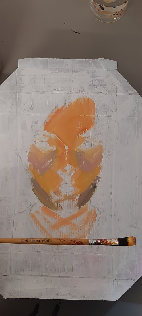

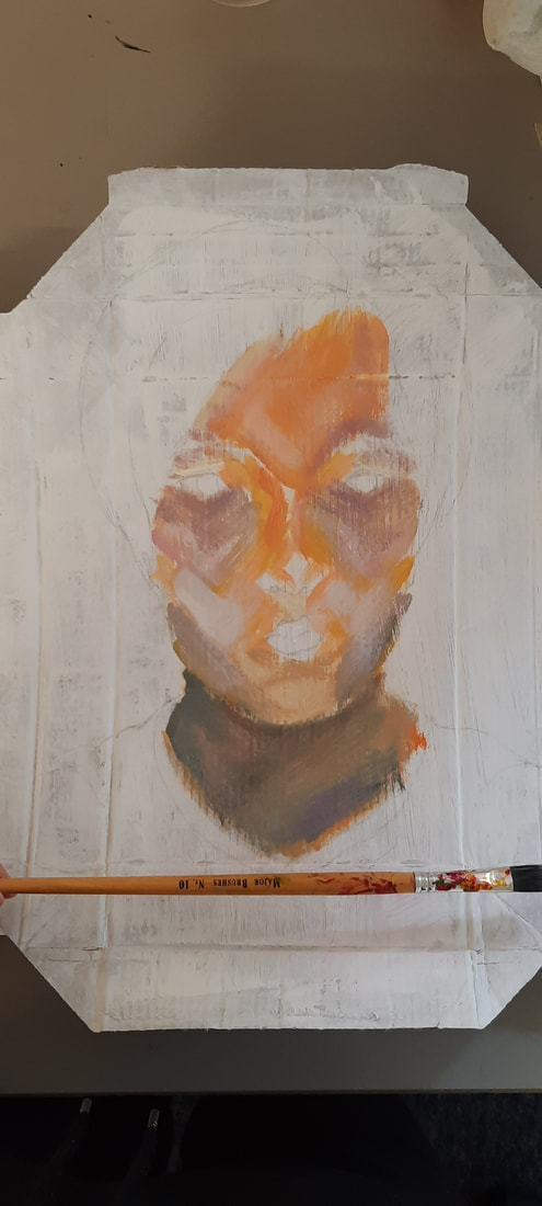

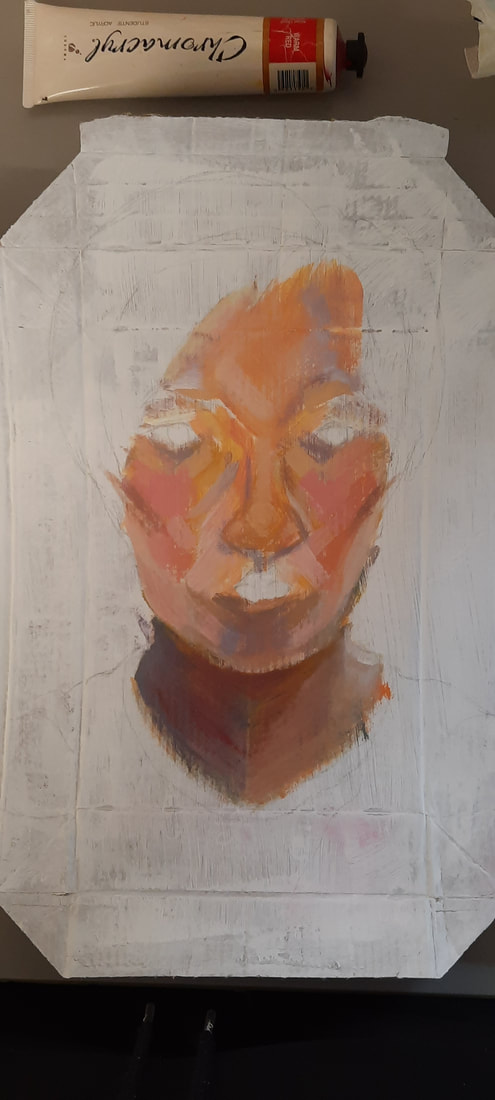
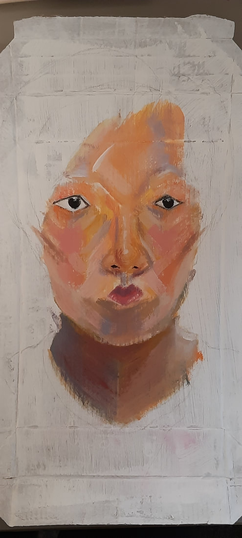


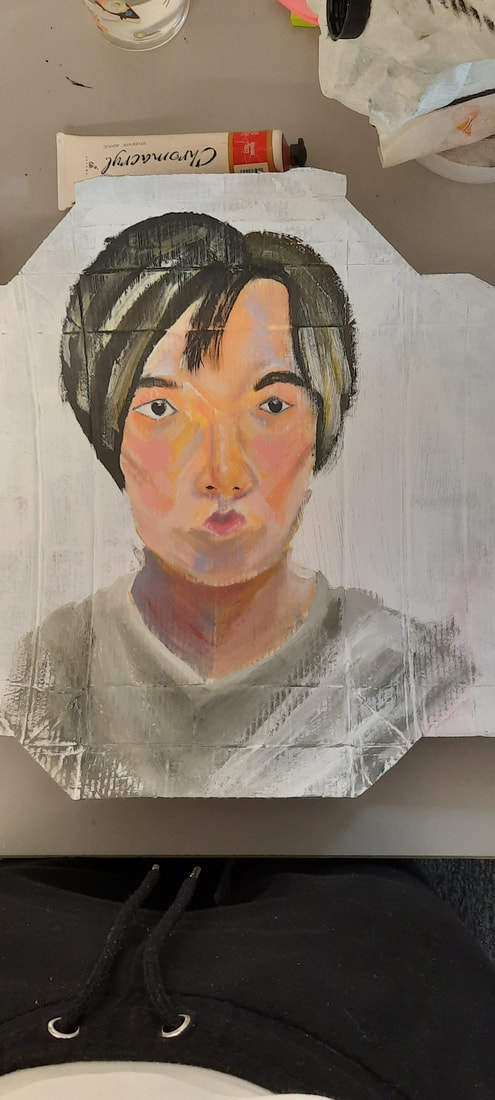
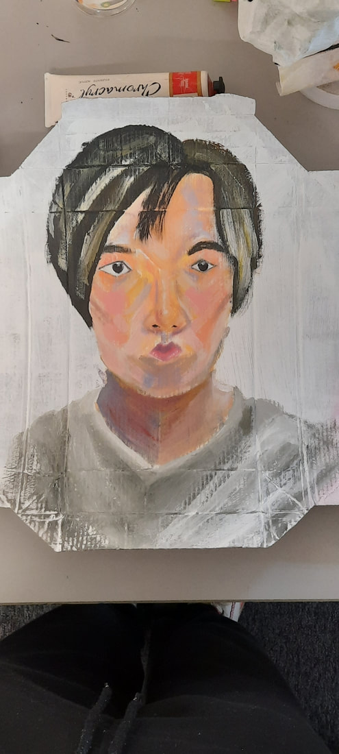

Throughout this painting, I had moments of despair because I had the Leyendecker library book open next to me for reference and I was being foolishly unrealistic with my comparisons to his work. Anyway, I diverted away from my usual blended approach with acrylic and aimed for broader and expressive strokes with a big brush. It was difficult trying to place the strokes in all the correct places and with the correct tones, but it seems to have worked well enough to resemble my features. The proportions were more emphasised than they are in real life, but I'm not sure this comes across clearly. I just wanted to show the different sizes and shapes of my pair of eyes, the rounder nose and mouth shapes.

Watercolour
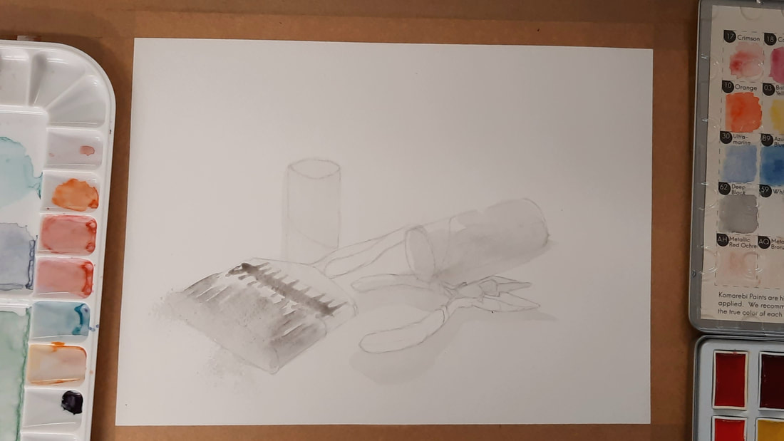
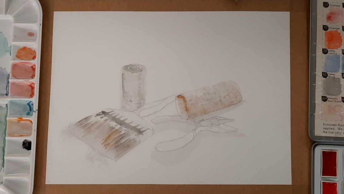


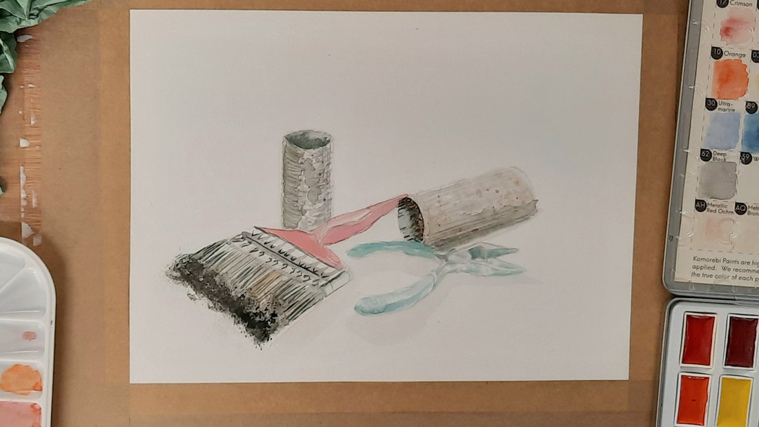
With Ravilious' distinct use of texture in mind, I painted with a sponge and various brushes. I found that the small flat brush was very helpful with the hatching. I reserved the sponge for the ends of the massive red brush in the painting. I think I stopped at the right stage as none of the objects appear overworked.
I am especially proud of the pliers as I took immense care to leave areas without any paint for natural highlights. This is usually always something I forget to do with watercolour and I end up adding white artificially with a white gel pen - but I succeeded here! The empty toilet rolls are the weakest link in this scene, but it's not bad enough to drag down the rest of the painting, I feel.
I am especially proud of the pliers as I took immense care to leave areas without any paint for natural highlights. This is usually always something I forget to do with watercolour and I end up adding white artificially with a white gel pen - but I succeeded here! The empty toilet rolls are the weakest link in this scene, but it's not bad enough to drag down the rest of the painting, I feel.

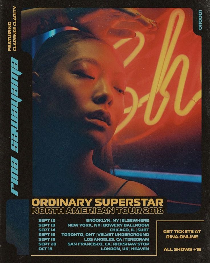
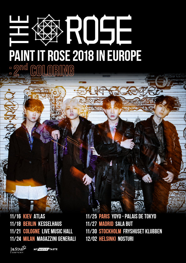
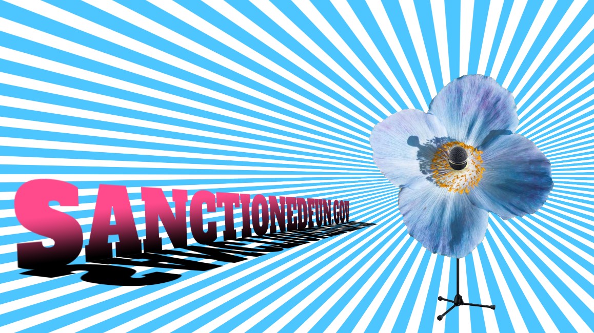
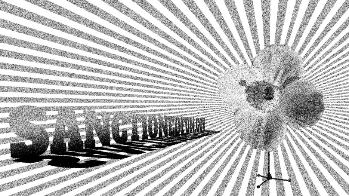
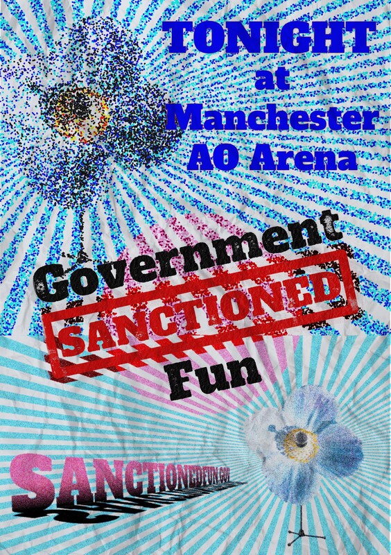
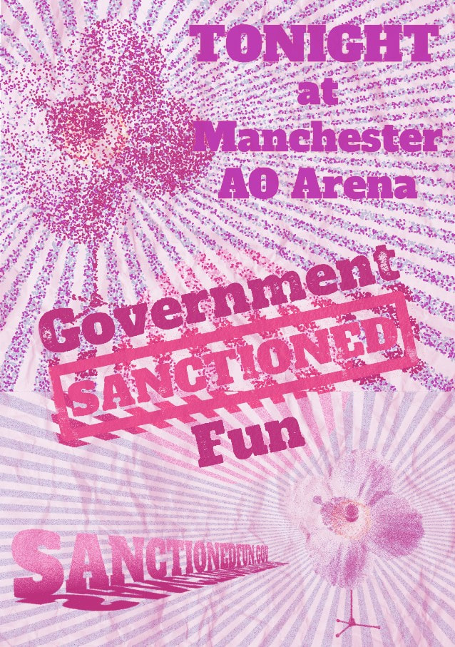
Week 5&6 - Gig Posters
I love the big scale and immediate impact of posters. They're my favourite things to design.
- Paula Scher
Research
My first port of call was the library, which had plenty of books featuring poster art.


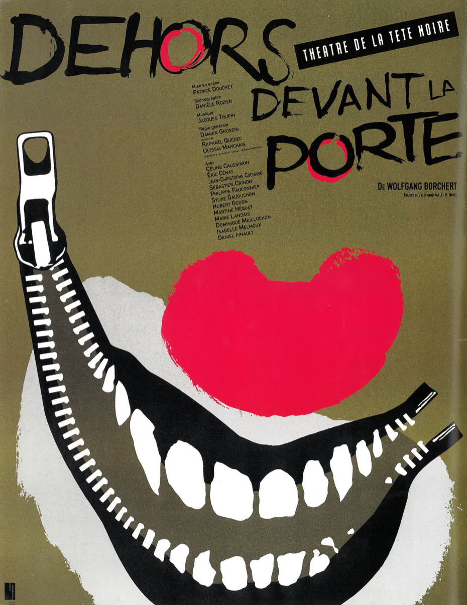
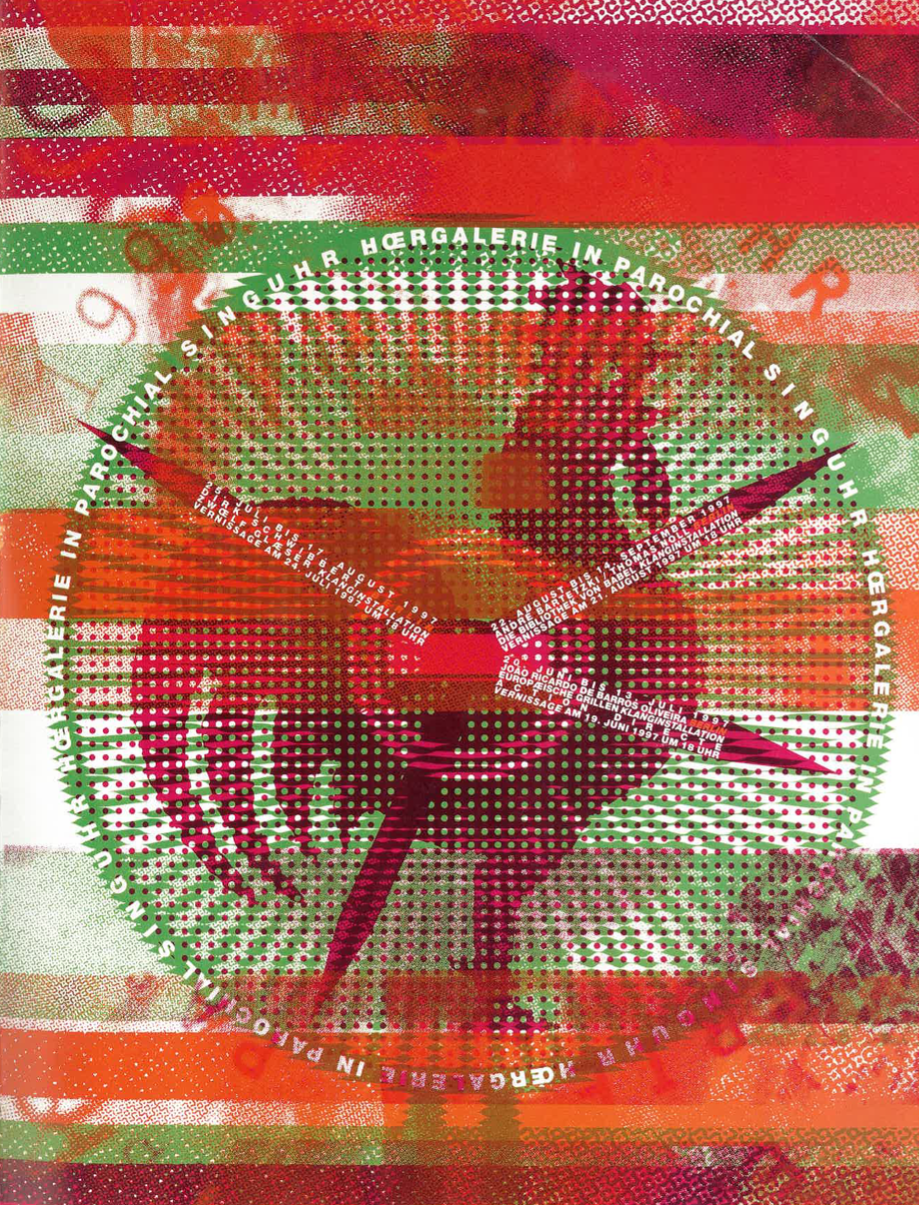
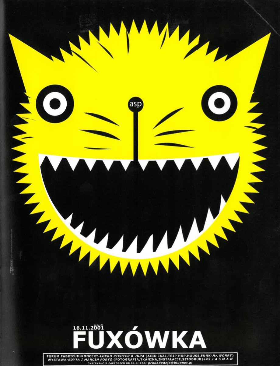
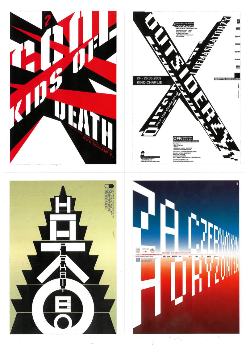
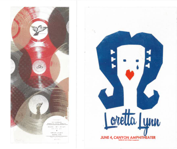
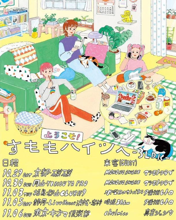
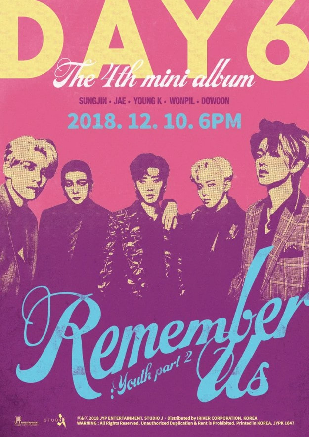
I also looked at the tour posters of the bands I listen to. They all appear to have been produced solely with digital techniques, usually with designs and typography that compliment the main image of the poster.


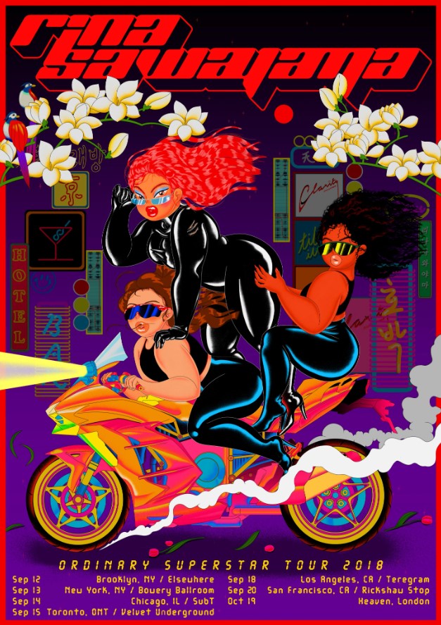


Tutorials and my attempts
|
|
|
|
Halftone
|
|

|


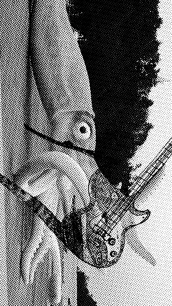


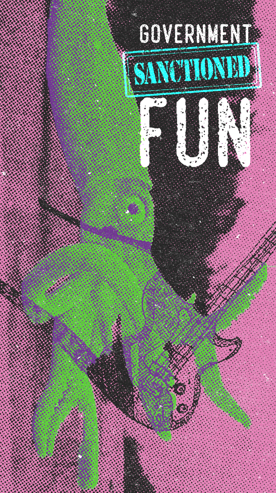
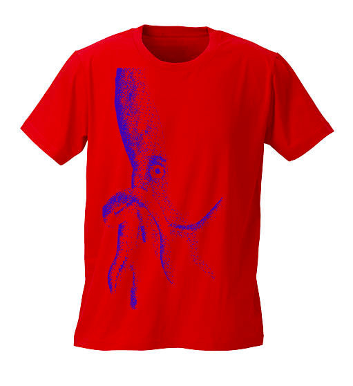
Stipple


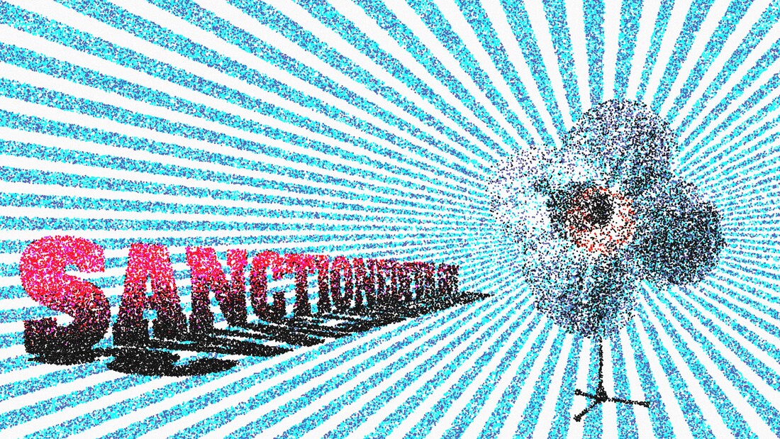

Development
|
|

|


|
|


Week 7&8 - Enamel Pin Design
Research
|
|
|
|
|
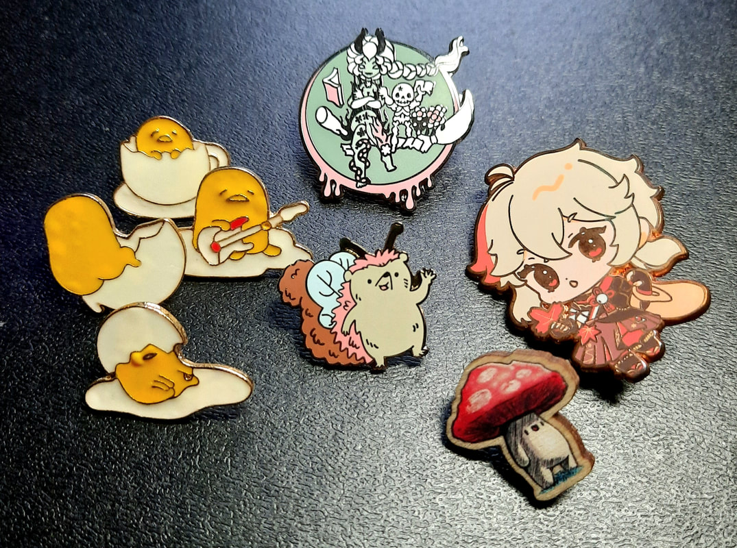
My humble collection
|
|
Trials
I tried out some designs with the pen tool and brush tool in Illustrator, playing around with different profiles of line for the stroke. It was done during a time restriction challenge for that particular studio session.


Initial ideas
|
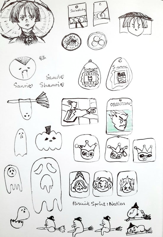
As I tried out a bunch of different subjects for the badges, I was feeling rather indecisive about which to develop properly into badges - so I headed to a trusted sketchbook to try and visualise everything as enamel pins on a backing card (as well as possible brands).
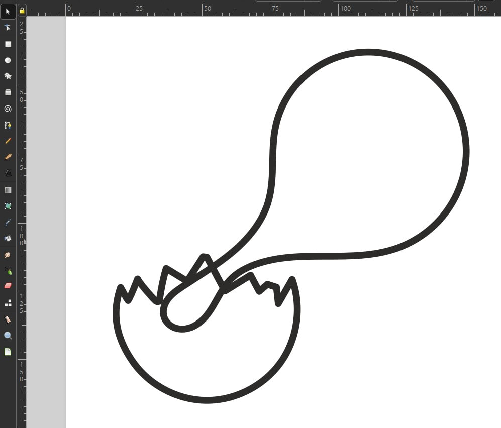
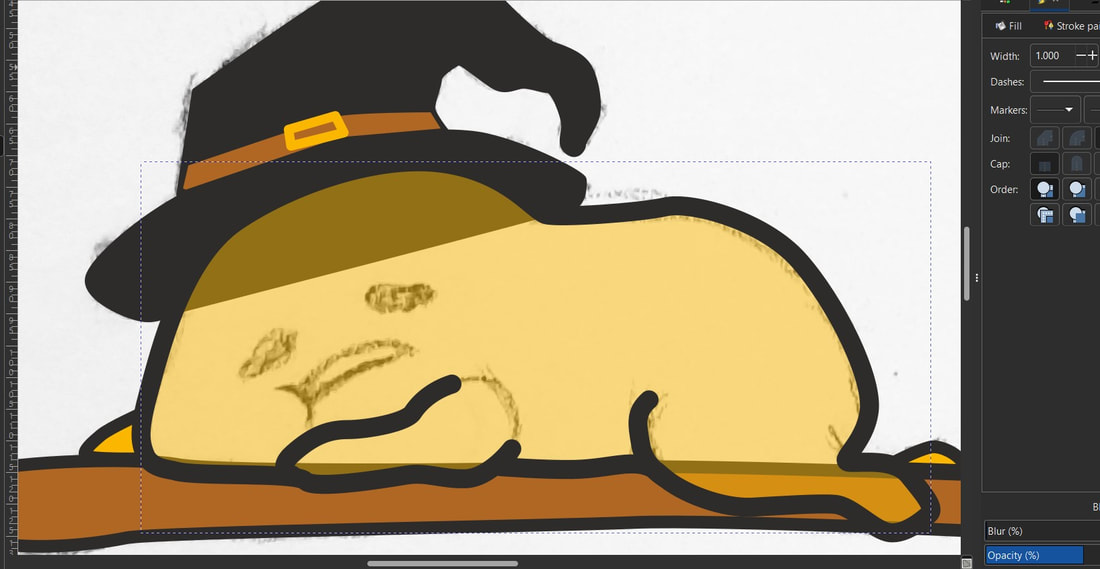
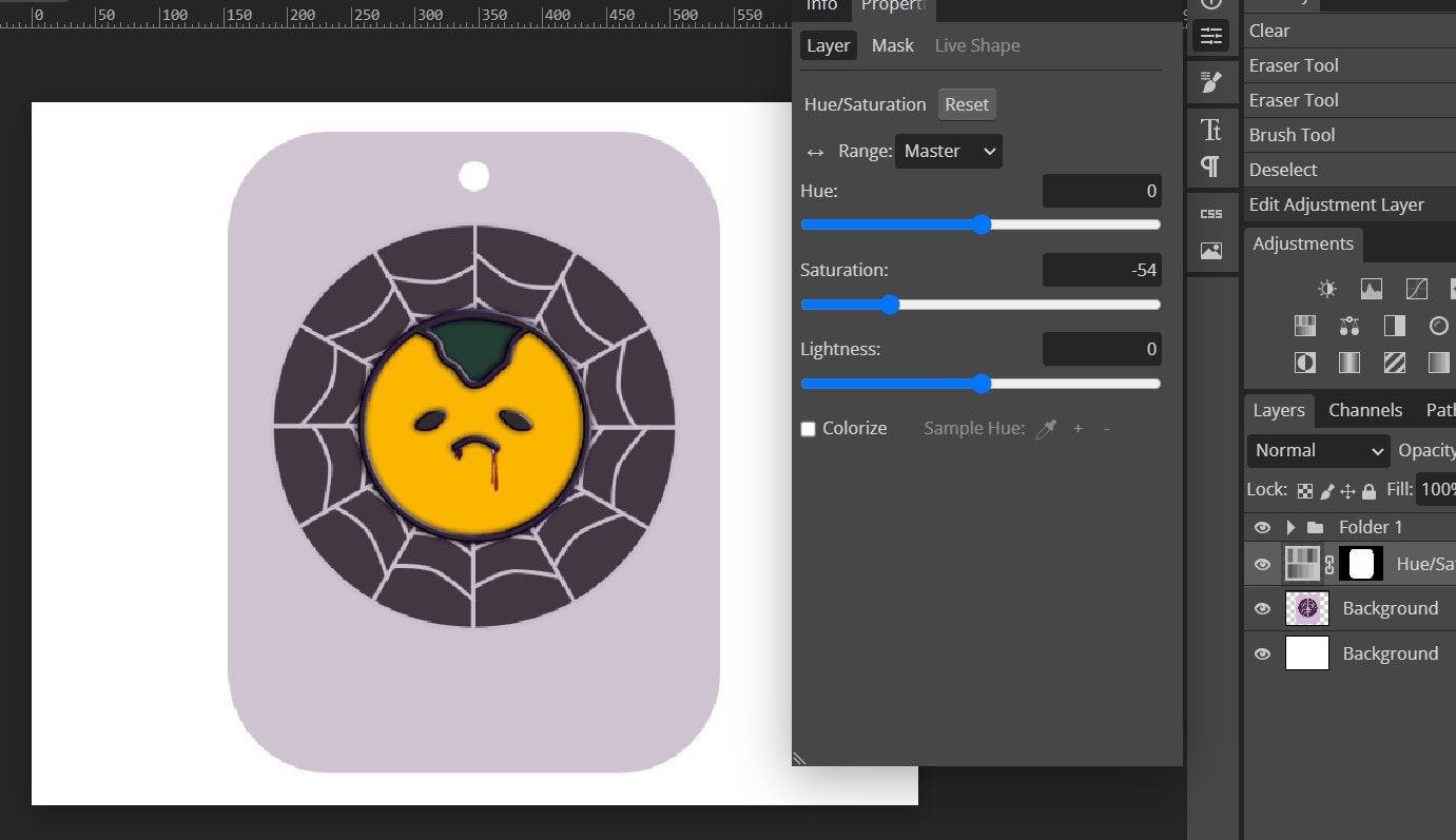
In the end, I decided on Gudetama (from Sanrio, Hello Kitty's company) enamel pin designs, but with a spooky Halloween theme. After finishing the design, I realised for the mock-up in Photoshop that I would need to have the line and colour on separate layers, so I pedalled back to do this.
|
Spooky Gudetama process
|
|
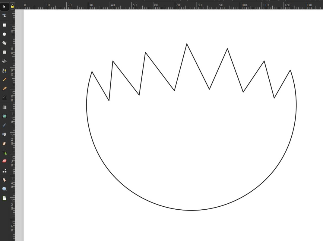
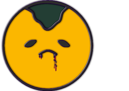
Stroke: PANTONE Pro. Black EC Yolk: PANTONE 124 EC Seaweed: PANTONE 560 EC Fang: PANTONE 290 EC Blood: PANTONE 187 EC |
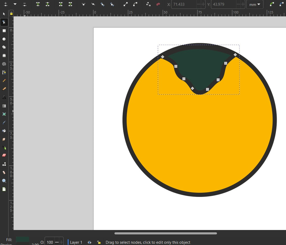


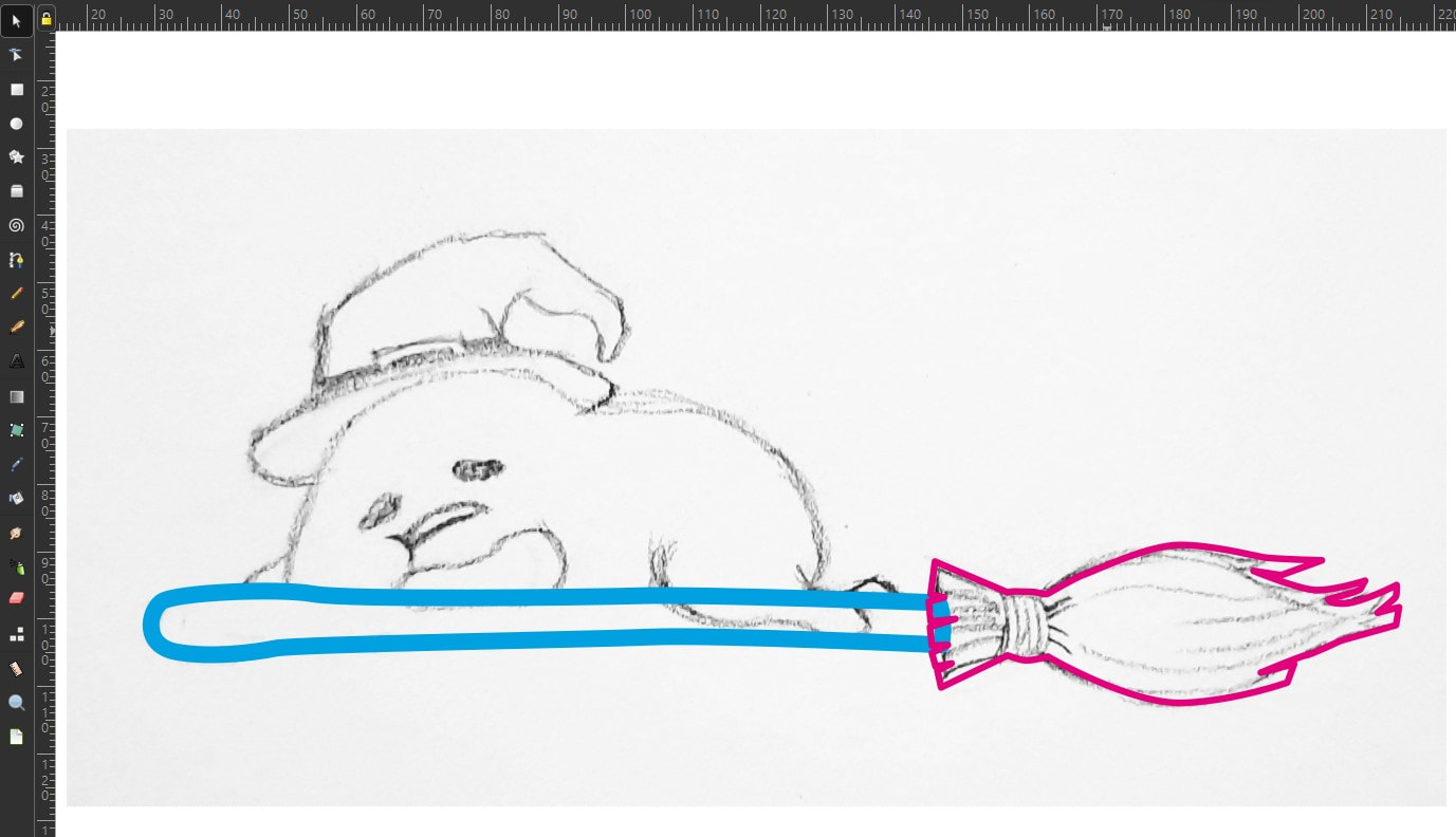
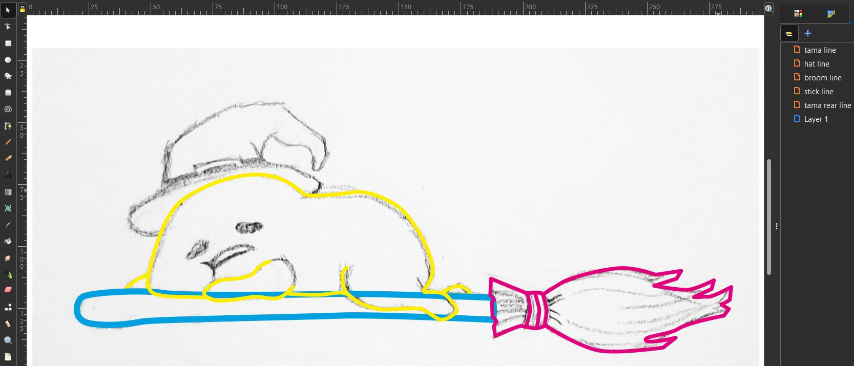
As well as using the curvature pen tool (Ai)/create Spiro path mode (Inkscape) for drawing round shapes, adding more nodes to a straight line and editing is also effective. When using shape tools, remember to convert object to path before selecting Combine to create the desired shape.
|
|
Stroke: PANTONE Pro. Black EC Ghost: PANTONE 317 EC Egg shell: PANTONE 427 EC Mouth: PANTONE Pro. Black EC |

|
|
Stroke: PANTONE Pro. Black EC
Yolk: PANTONE 124 EC Hat: PANTONE Pro. Black EC, PANTONE 124 EC, PANTONE 7512 EC Broom: PANTONE 7512 EC Mouth: PANTONE 427 EC |


Backing card ideas
I wasn't sure whether to design one backing card for all three badges, or to have three separate designs as each pin is quite different from each other.
|
Mock-up process step-by-step:
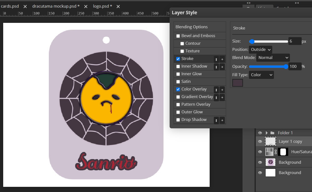
If the stroke appears too thick, change Stroke Size from 2 px to 1.
|
Final pins


Backing card process
Instead of trying to make a close match, I decided on using a more legible script font for the Sanrio logo. I drew a little devil so that it was more on theme.
|
|
|
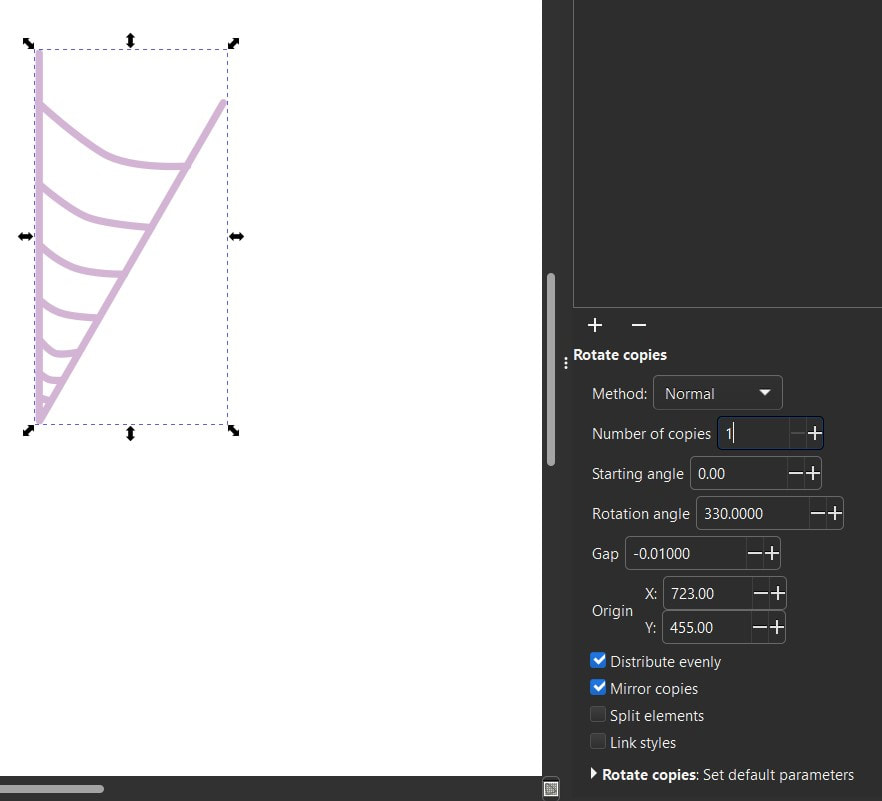
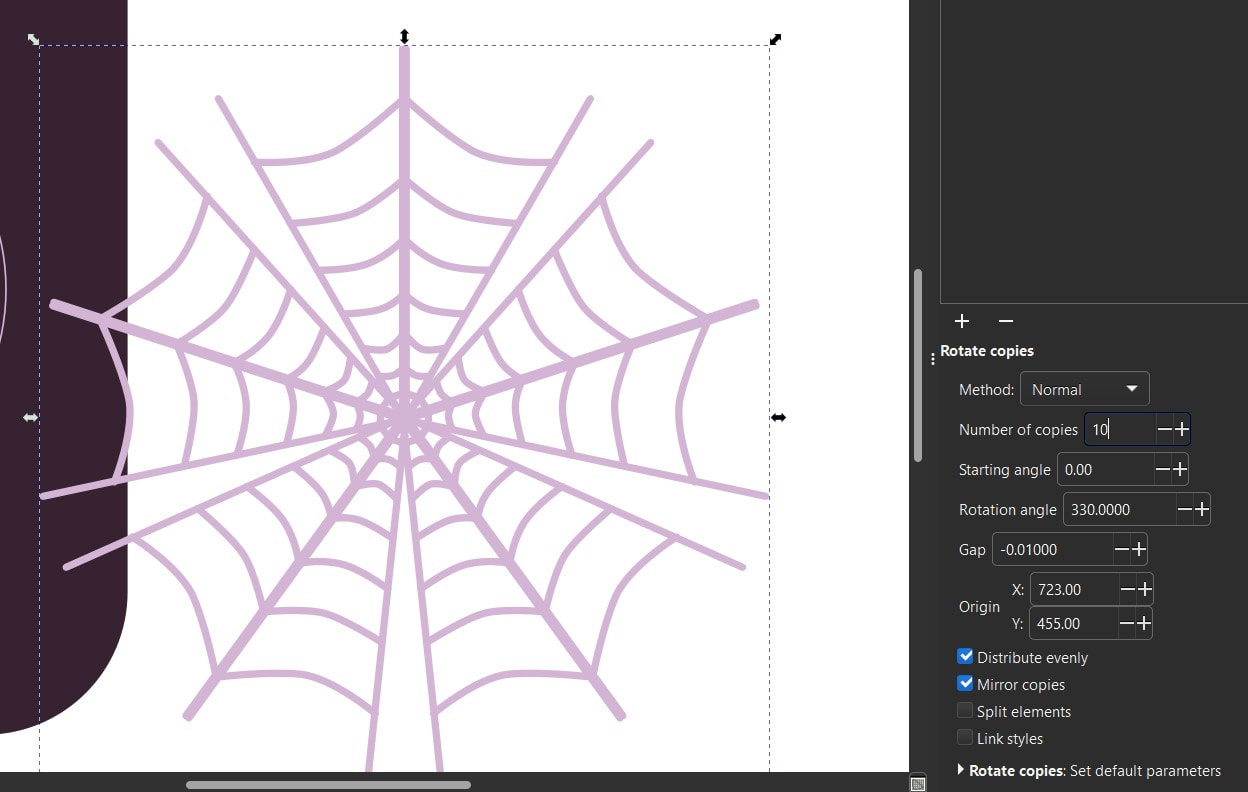
Using the Path Effects tab, I figured out how to make a spider web (although it took a bit of trial and error to get right). I was originally going to go the plate idea from my thumbnails, but I decided the usual food theme in typical Gudetama art did not apply so well here. So with the playing card tutorial in my mind, I created my own graphic with the shapes as a base.
|
|
|


The process for each enamel pin was generally the same. Most of the time went into tweaking the Blending Options settings and choosing the most appropriate colours for the designs.

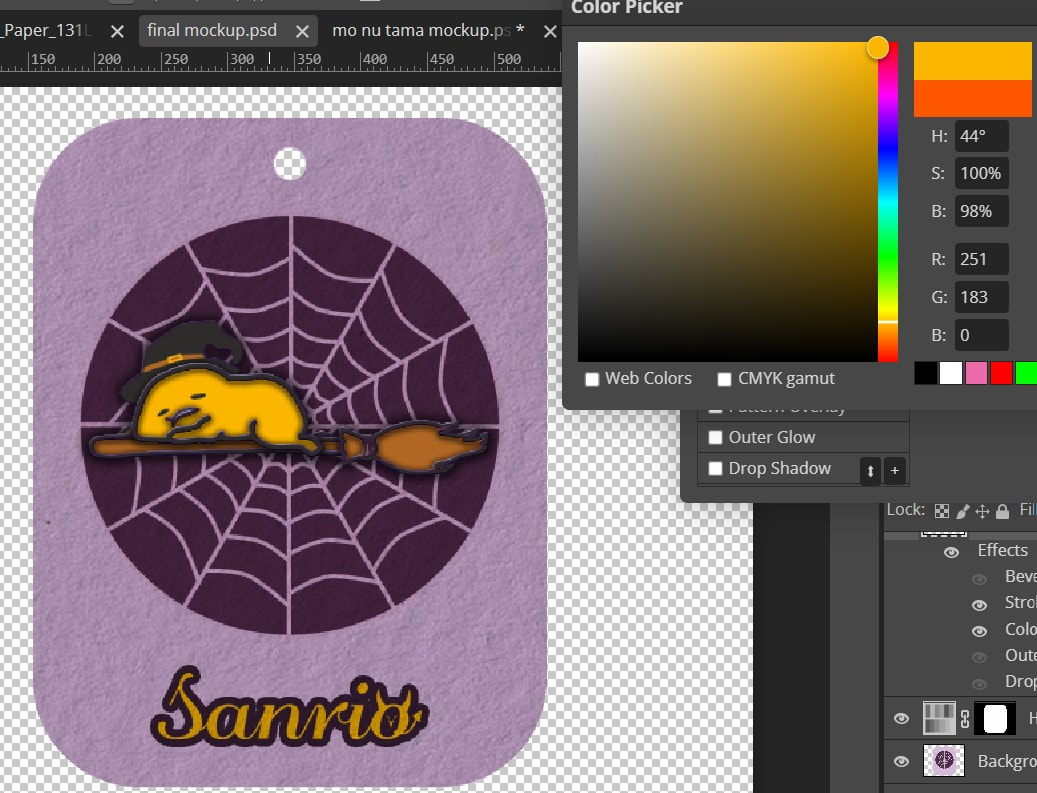


- FINAL OUTCOME -
I am rather proud of these and wish they were real because I know my younger self would have bought these on the spot.
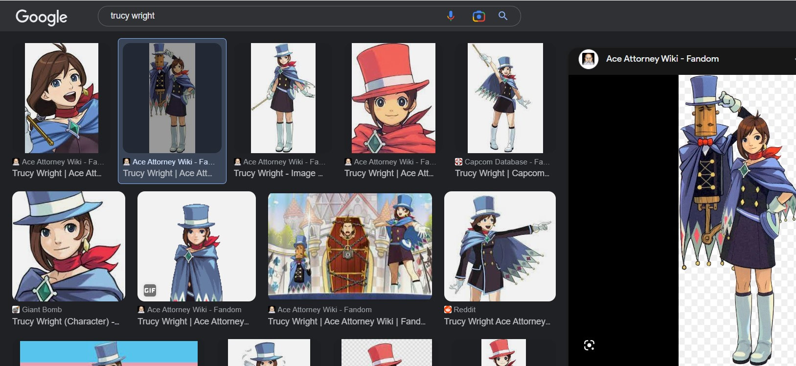
As these designs were rather simple, I decided to challenge myself with more detailed designs, this time based on three core characters from:
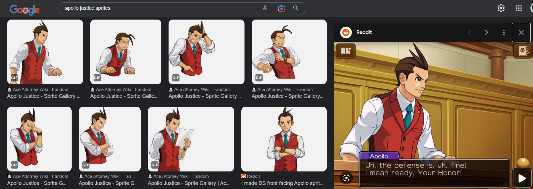
Ace Attorney


Weeks 9-12: Concepts
Through the magic of thumbnailing, in this block, we'll be honing our composition skills for different contexts.
Research
|
|
|
|
|
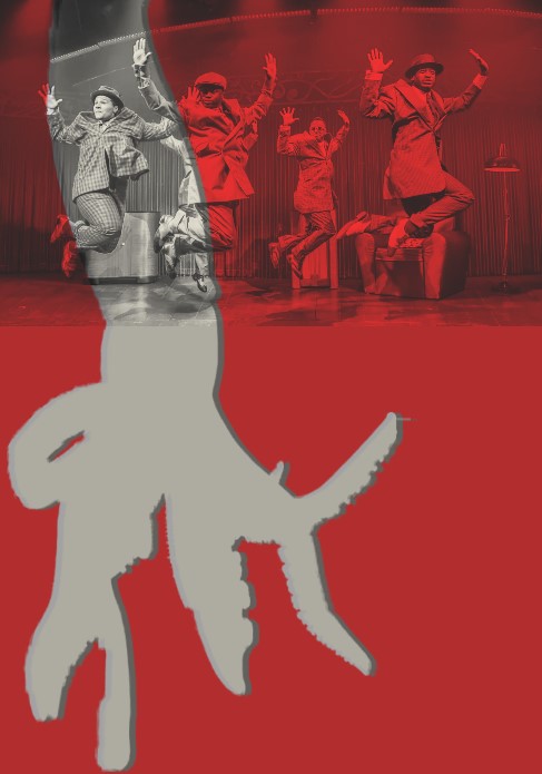
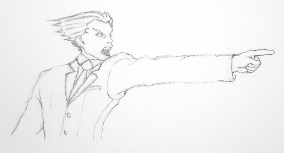
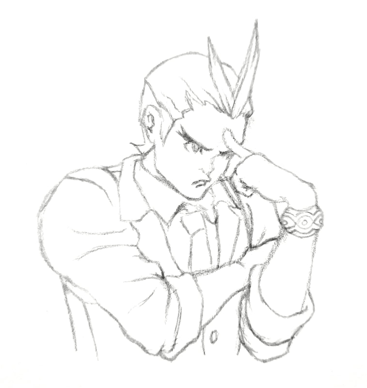
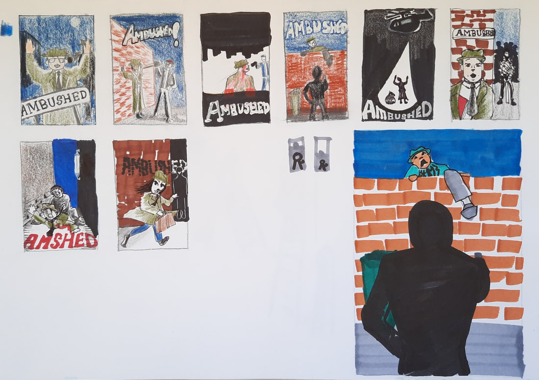
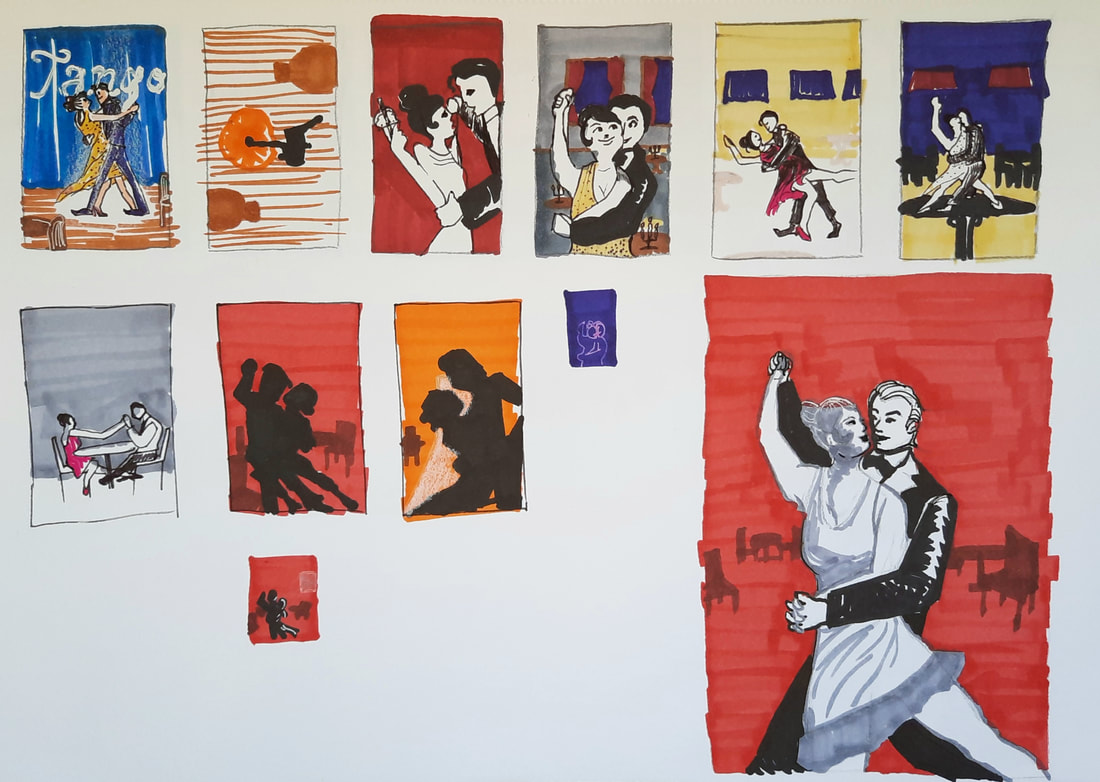
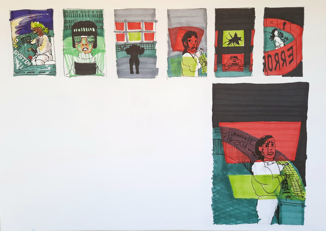
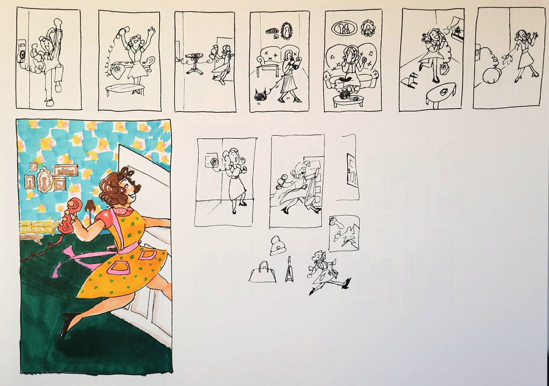
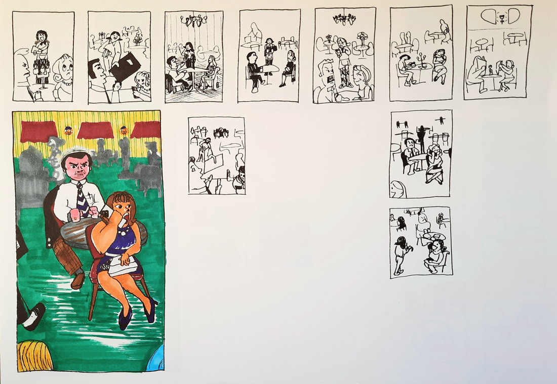
Week 9 - ACTION!


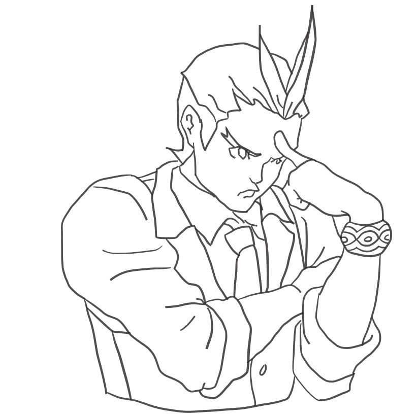
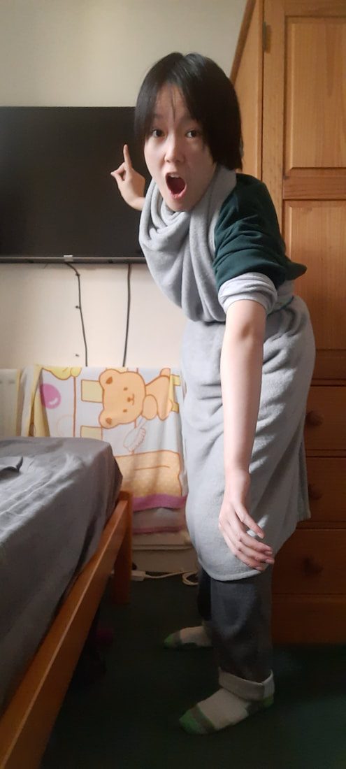
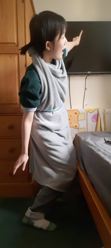
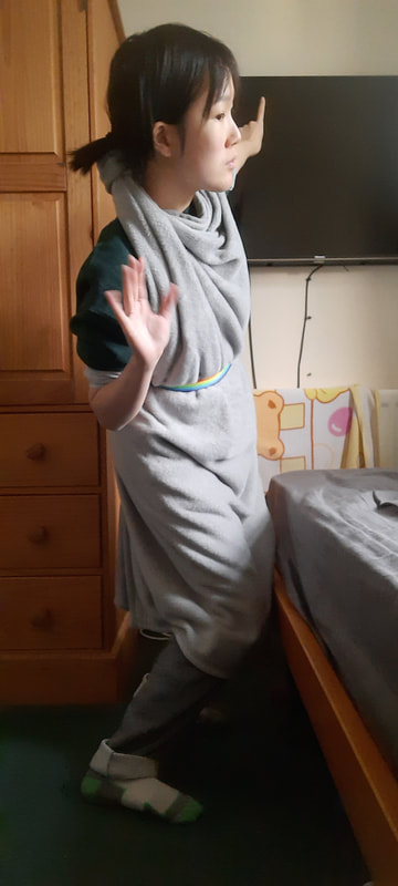
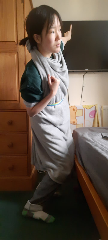
Week 10 - Body Language
|
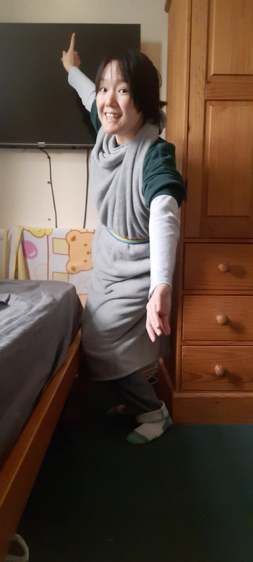
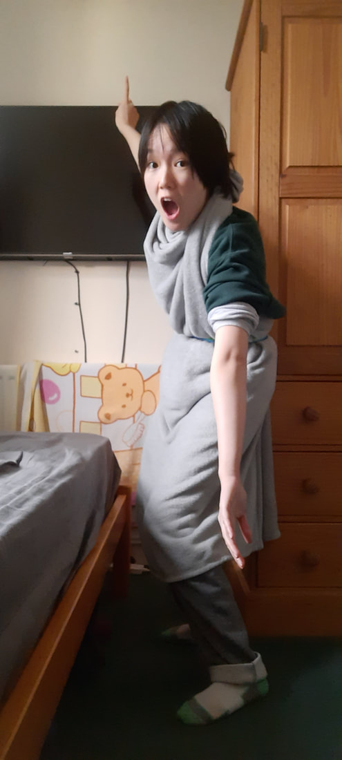
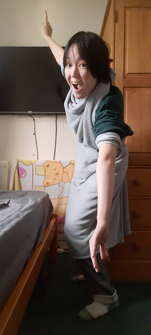
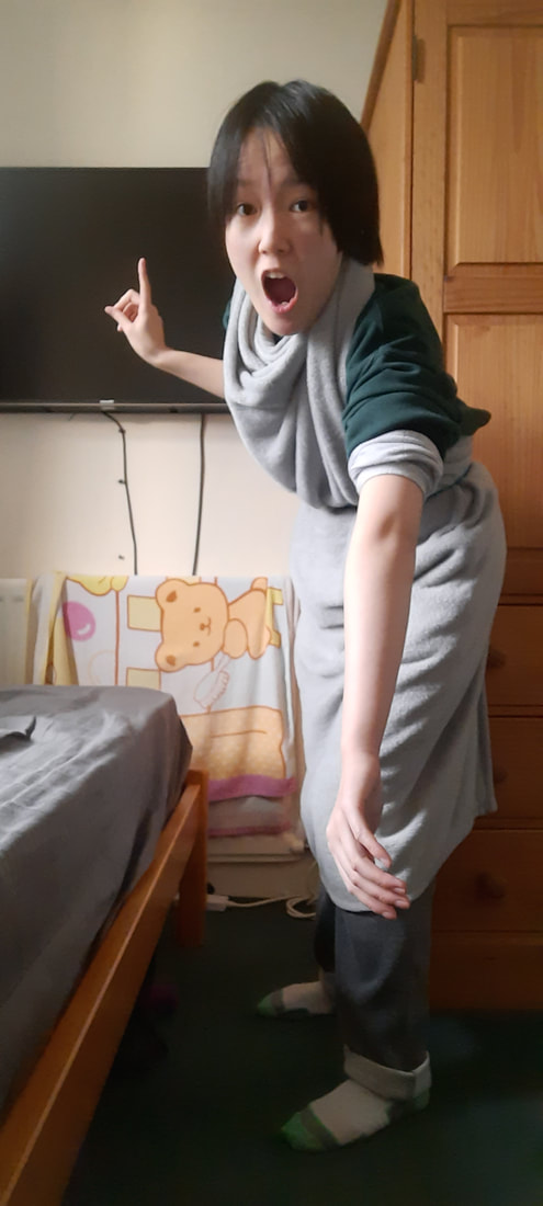
Reference images for some client visuals:
|
|
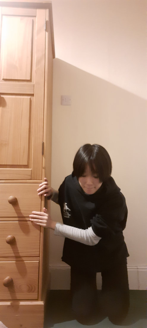

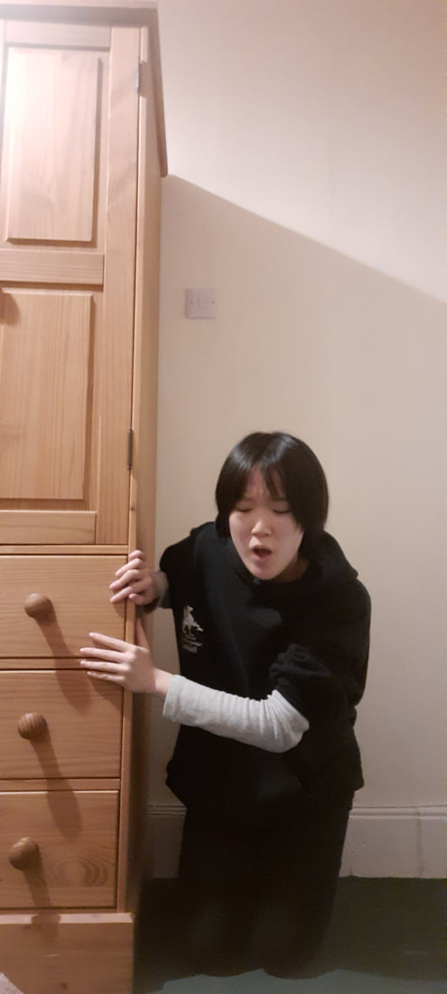


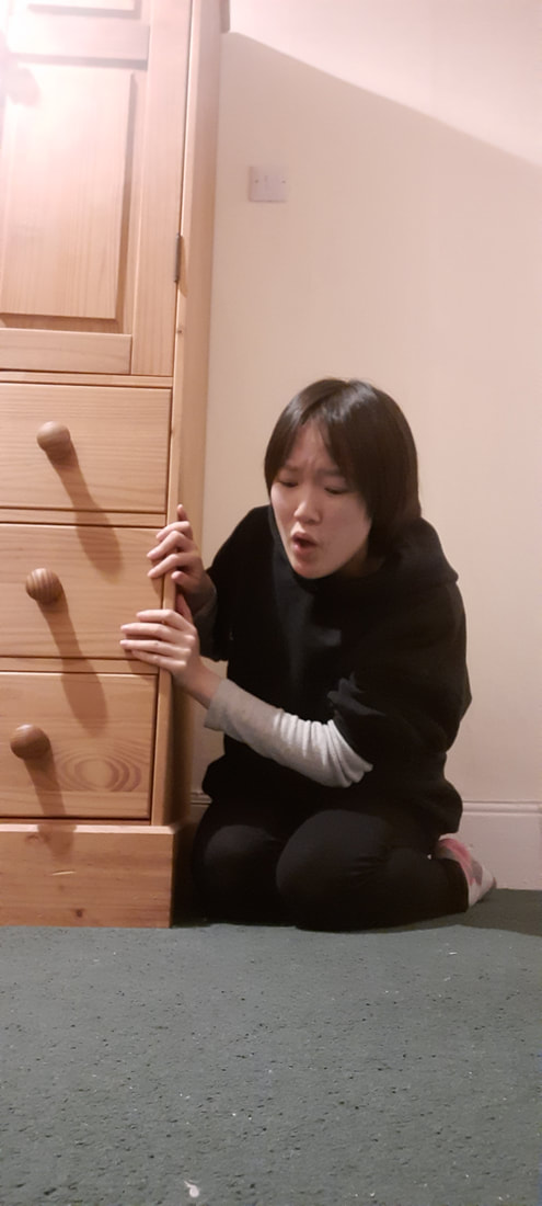

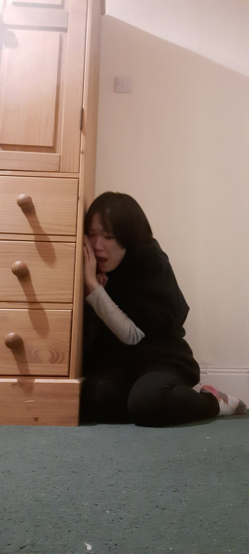

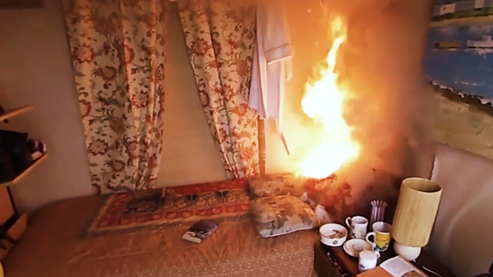


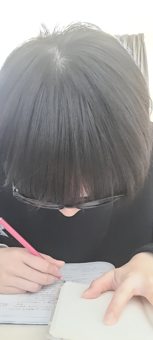
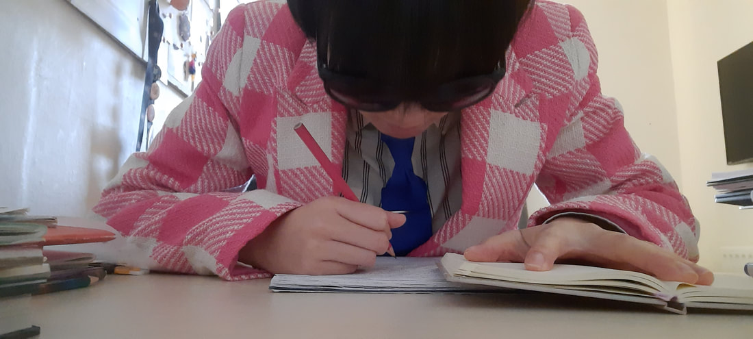


Following a very insightful tutor-led discussion after the completion of the Angry Boss set, I started to consider more aspects with my composition ideas and making sure I was thumbnailing more effectively.


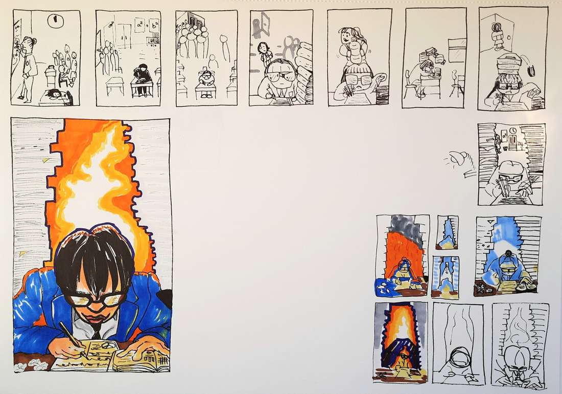
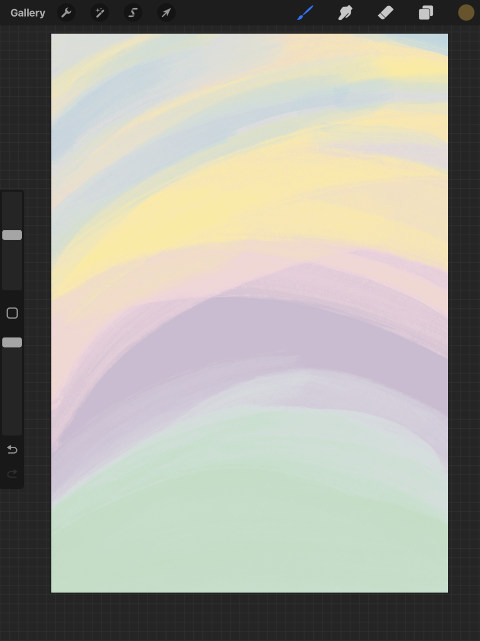
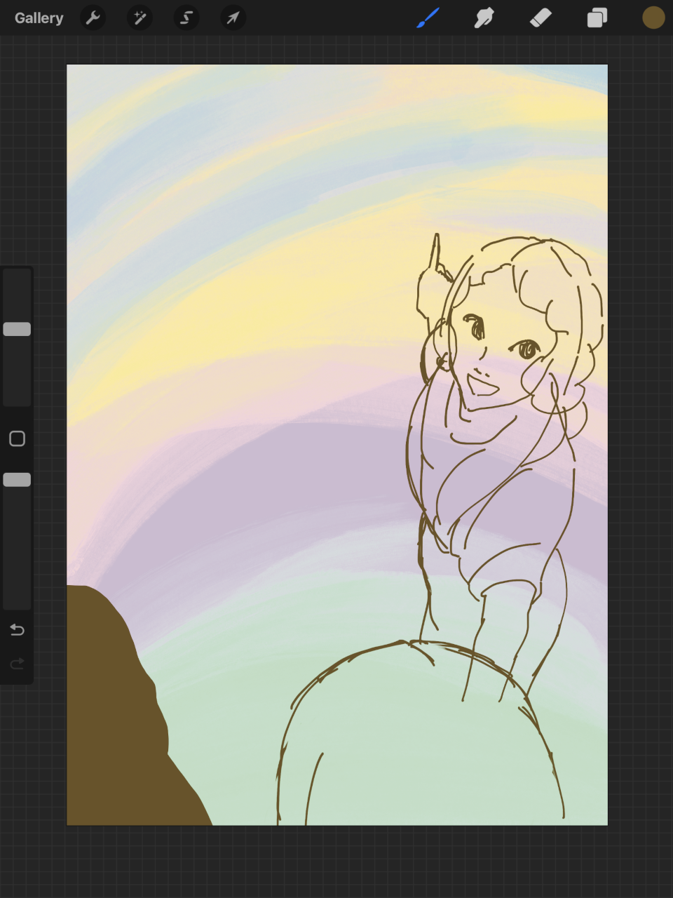
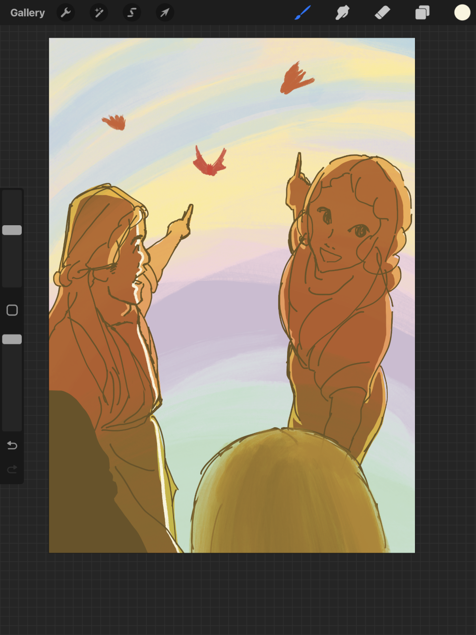
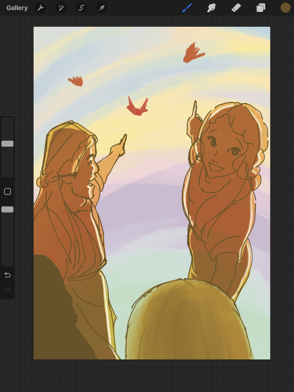
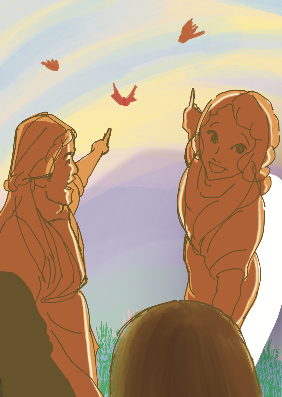
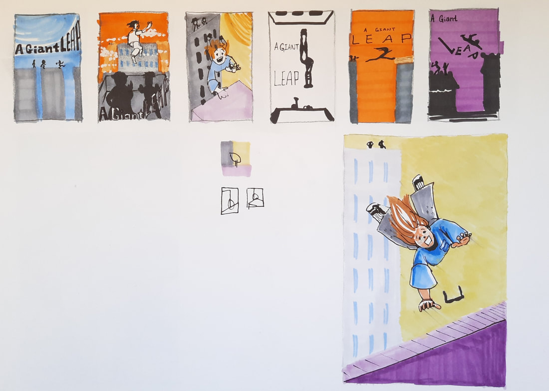
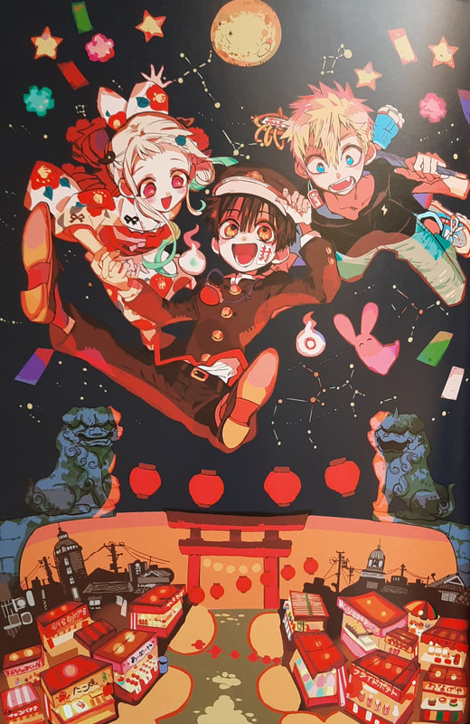
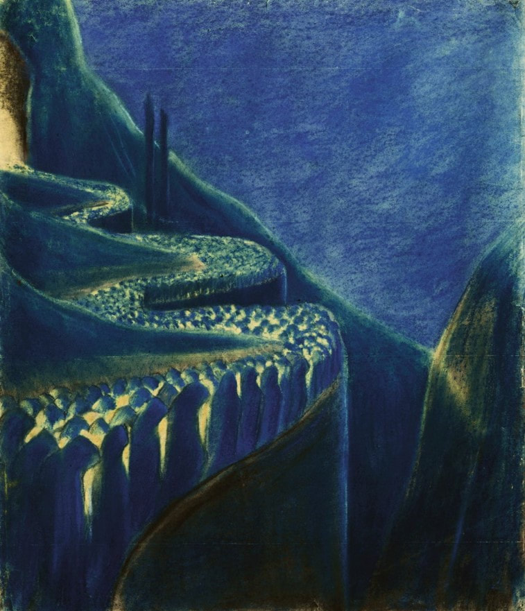
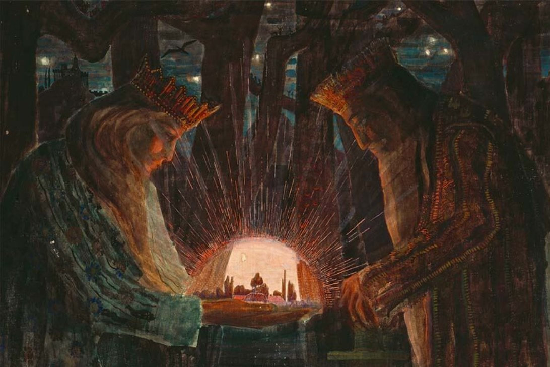
Week 11&12 - Communicative Colour
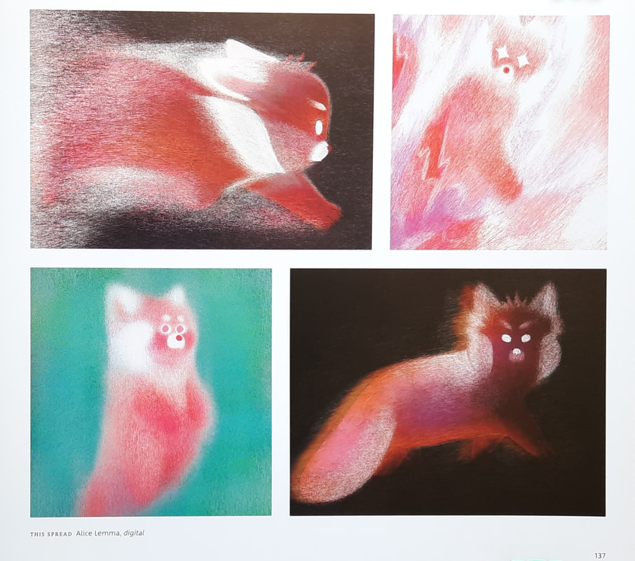
Artist Research
|
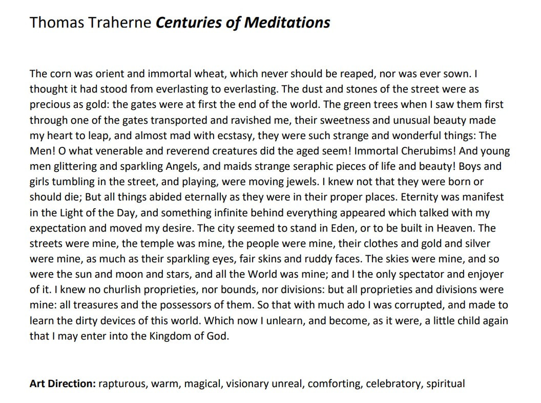
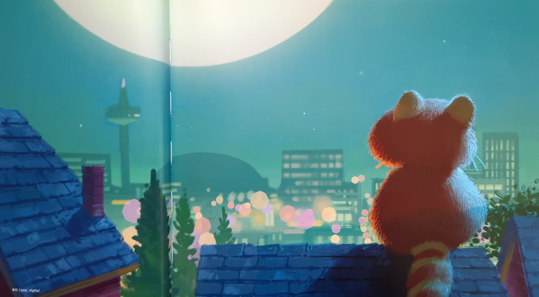
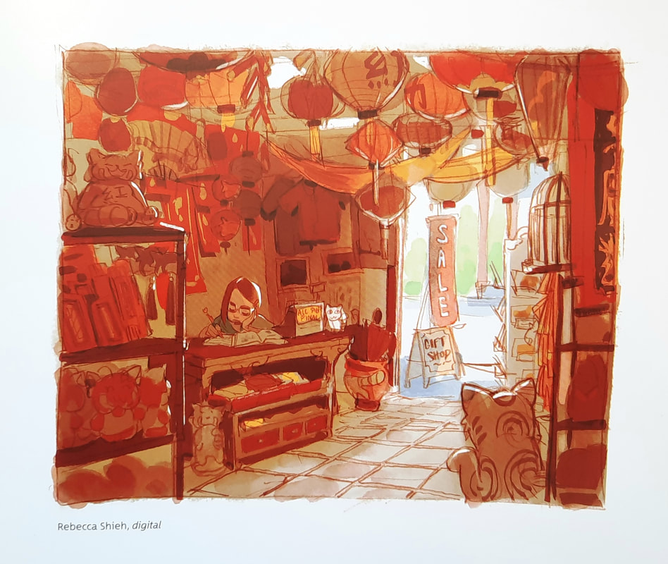
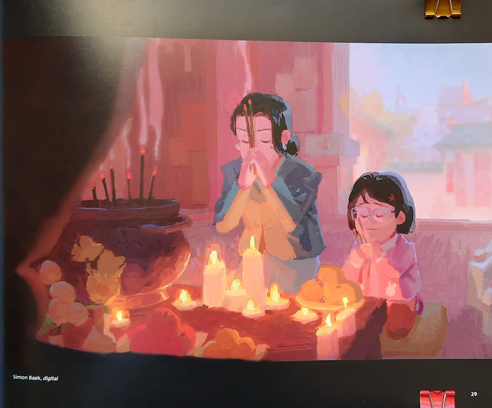
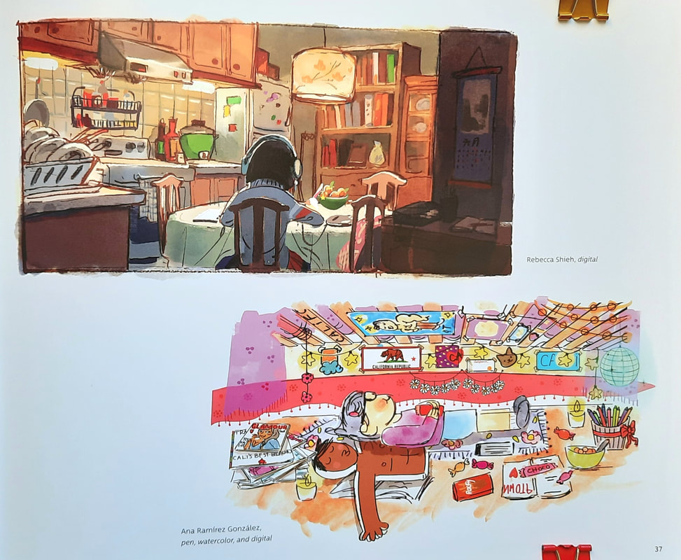
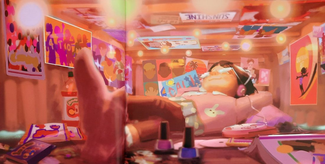
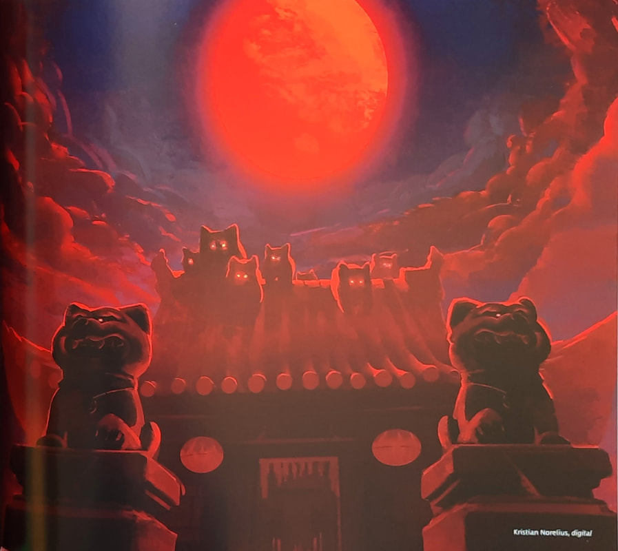
The Art of Turning Red
|
The Art of Toilet-bound Hanako-Kun
|


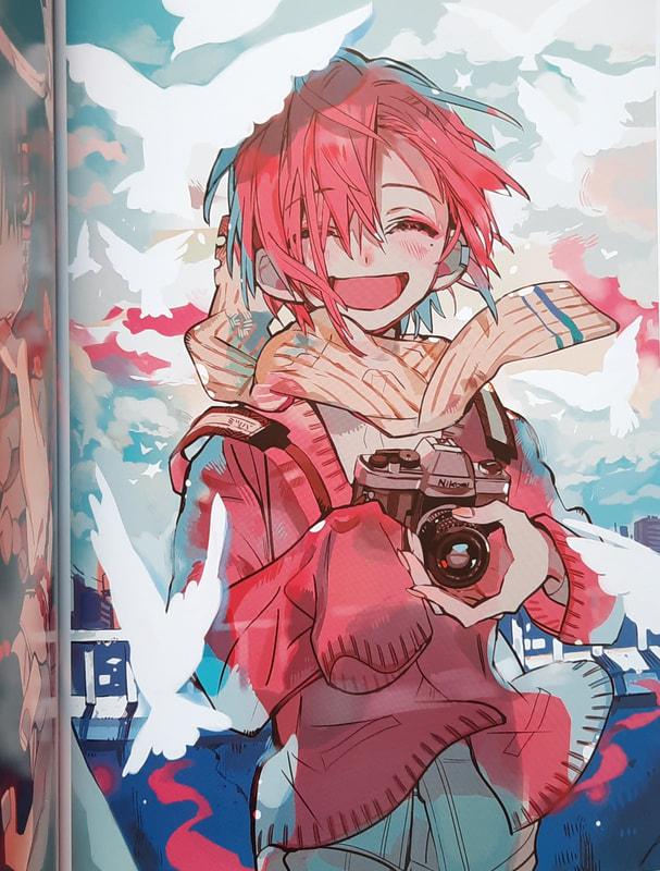
Luis Mendo
|
Mikalojus Ciurlionis
|
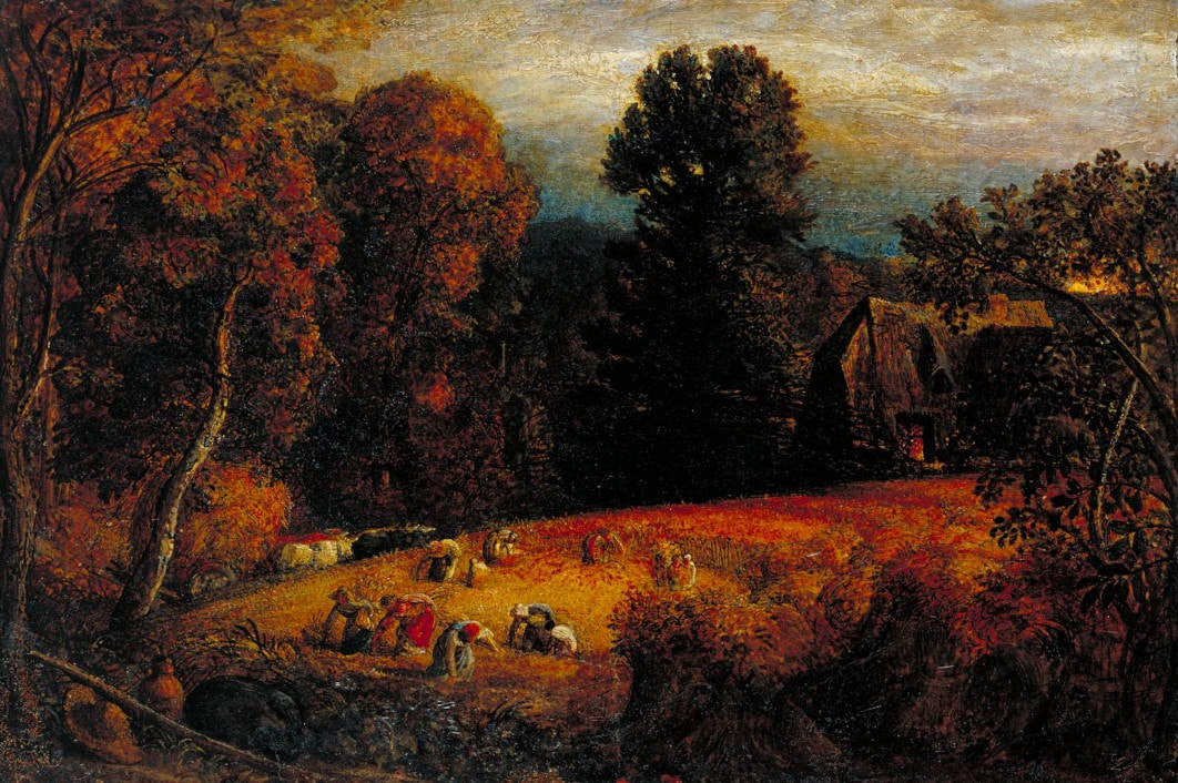
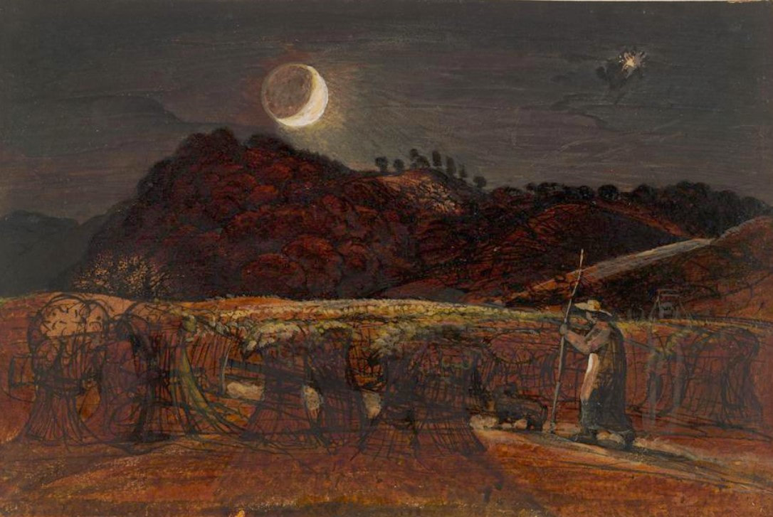
Samuel Palmer
|


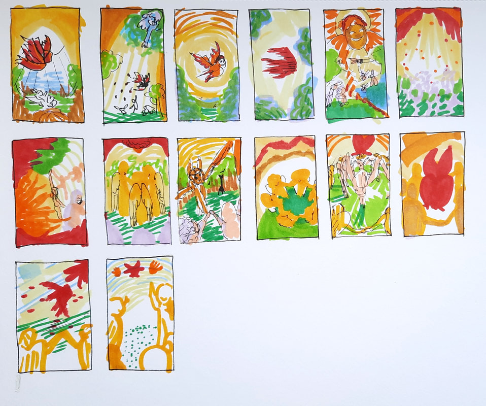
Thumbnails
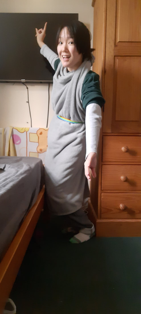
As it was very informative last week, I took reference photos for the final illustration.
|
|


- FINAL OUTCOME -