A link to the full brief
For 3D, we will be producing album cover artwork for an undiscovered new band. It will first be in the form of a 12" x 12" x 12" box as the final outcome will be a photograph. The focus is on constructed spaces, something the creator Joseph Cornell excelled in. As such, anything - from found objects to old socks - can go in this box.
Band: Hot Bedding
Album: Roadkill Eagle
Genre: Electronica
(From a randomiser, I had no part in this)
Initial Research
The most important part in the beginning is to get to know your genre, of course! To start off with, I found out about the origins of electronica - 1990s, UK - before listening to a wide range of music within the genre. I made sure to listen to the pioneers, the top electronic acts in the UK and more contemporary electronic music. Simply put, I went from the Chemical Brothers to Shygirl.
I also listened to electronic artists from this list here. The aim of listening to a whole bunch of electronica was so I could understand the mood and get a deeper feel for the vibe of the genre since I don't listen to it usually. One thing I noticed about the aesthetics, is that the visual language for the album art and music videos was extremely varied and unique. Each artist had their own distinct style and aesthetic within the genre. It felt like electronica encompassed anything and everything, with a lean towards the weird and wonderful.
Moodboard
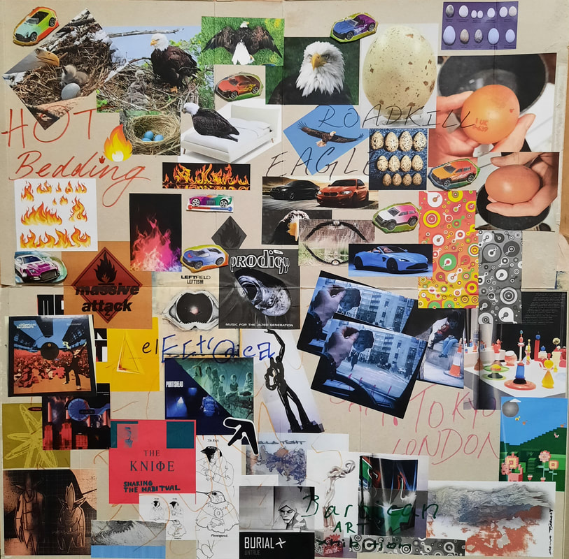
This is a visual culmination of my research so far. It's my first time trying to make such an immersive mood board that isn't just a collection of images labelled 'moodboard'. I used some cereal boxes for the board and I quite like the handmade quality of it, with the card peeking through the collage. JAM: Tokyo-London is the title of a book filled with various artists that caught my eye in the library. I chose it because visually, it suited my genre and had a similar funky aesthetic as the electronica album art I looked at previously.
Idea Generation
Laser Cuts
|

|
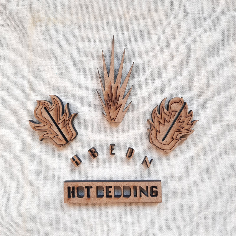
There was a workshop session for the laser cutter, so I chose the flame design that could be slotted together. I had to laser cut the flame twice because I forgot to adjust the width of the slot when I reduced the size of the design to the actual dimensions of the MDF scraps we were using. It worked beautifully once I tried again (as you can see). Most of the letters to my band name 'HOT BEDDING' were lost to the laser cutter since they were incredibly minute, but luckily some survived.
I played around with different compositions for this group of objects. The main purpose of the photoshoot was to take advantage of the gorgeous sunlight, but I got carried away with combining the pieces in as many ways as possible.
Thumbnails pt.2
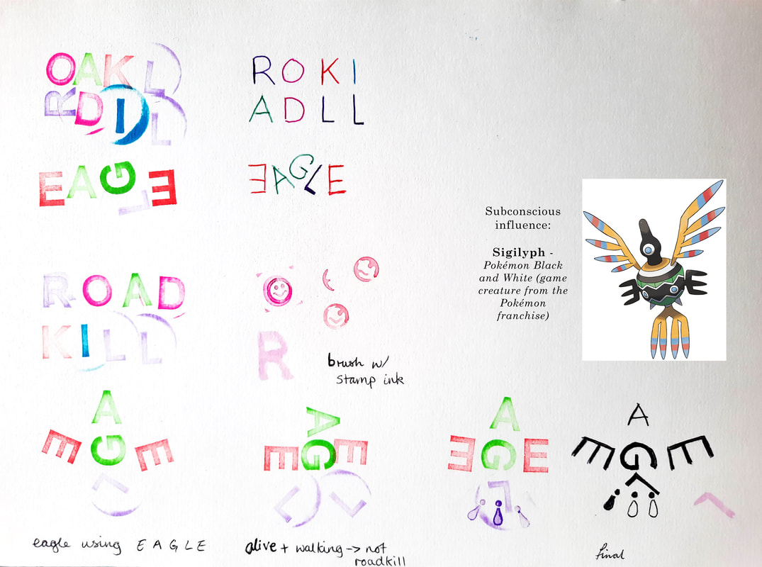
A piece of feedback that really stuck with me was that while I started off with a very literal take on what I'd been given (Hot Bedding and Roadkill Eagle), that it could develop, visually, into something more abstract. I really liked the sound of that, so with the rest of my thumbnails, I tried to explore this. The pop of colour featured on the second page is from a set of alphabet stamps I bought at B&M.
Featured Objects
The car and egg were from B&M. It may be a dinosaur egg, however, I chose this because the speckled pattern was similar to the eggs from the golden eagle species (I dropped it in the shop, hence the crack and disappointing reveal of a puny dinosaur - the packaging boasts a 'gigantic' size). As I have prior experience with the versatile medium of wire, I made a flame I could use for my box.
Stamp Experiments
I found an old set of small woodblock stamps that had some neat extras along with the alphabet, like the smiley face. During this session, I overheard a tutor mentioning to a peer that although we were creating a 12 x 12 x 12 box, it didn't have to look exactly like a box. This led me to consider the possibility of flame-shaped walls.
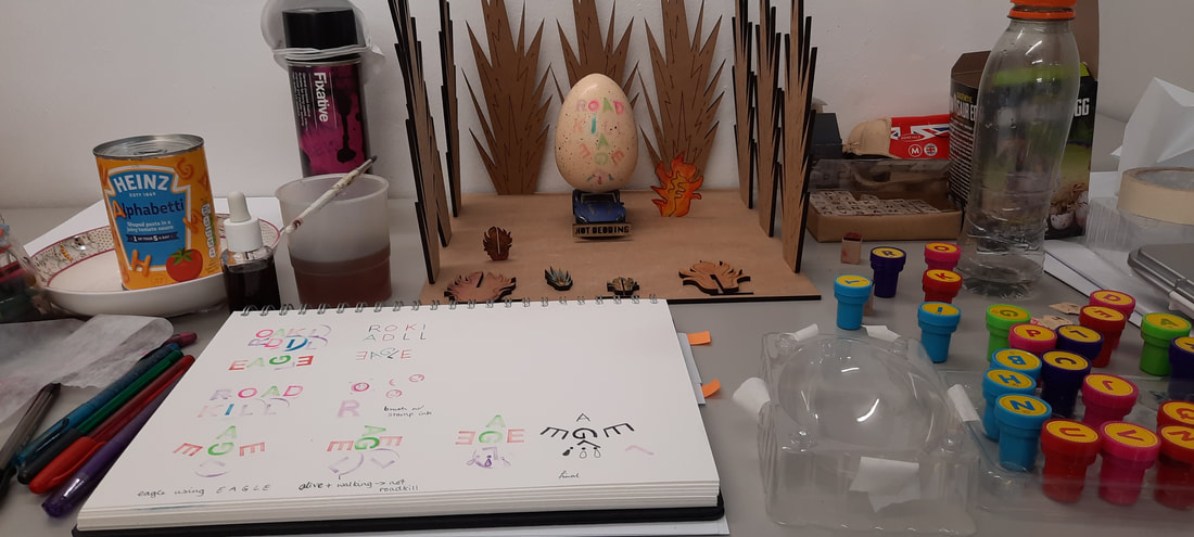
The Box!
The slots mean I can move and remove the flames for a wider range of compositions later. I also like how the flames resemble explosions, having another layer of interpretation results in a more engaging piece overall.
Preliminary play-around
The 'Hot Bedding' block was originally just a sample laser cut piece, but I wanted to incorporate it into the composition somehow, so I curiously combined it with the car and it was incidentally the perfect size as a registration plate. It was decided then that I would therefore be stamping 'Roadkill Eagle' onto the egg.

It was quite a journey to get to here.
I had to re-stamp the letters several times, especially for the less pigmented stamps, such as the purple type.
I then had to repeat the process when I foolishly sprayed fixative (it was probably applied too close) and the ink ran.
However, I found that the fixative had actually given the ink a better surface to adhere to, and that there was now a crisp edge to some of the letters.
Sadly, when the wire lettering is used as a nest, Hot Bedding can no longer be read.
Composition Trials
Here, I practiced different layouts, varied the proximity, angles and combinations of the objects.
Behind the scenes
I'm not sure whether flash or non-flash photography is more suitable. The colours on the egg stand out more in the photos taken with flash.
The alphabetti definitely appears more appetising in the photos without flash present, but other than that, I am still stuck for choice. Perhaps after some additional lighting and a proper backdrop, I will be able to choose the more appropriate style.
Final Tests
There were a couple things I actually hadn't tried out yet, so I did that first before preparing for the album cover photoshoot.
Cover Shoot
This is the 'clear' set of photos. The new and glowing edges are produced by placing my fingers in front of the camera, combined with flash, it has this interesting effect. If the camera captures my fingers in a certain way, it also provides a slight tinge of peach. Without flash, the fingers provide a subtle shift in colour at the edges instead (see 3rd photo). I accidentally discovered this effect in the past when photographing a personal piece.
This set of 'blurry' photos was produced with cling film stuck to the camera. The pink tinge is from adding a layer of pink highlighter to the cling film. I experimented with the placement of the cling film to see if I could have some parts that were less blurry in the photos because I wanted the egg and Roadkill Eagle to look more crisp, so it would be a stronger focal point and contrast against the blur surrounding it.
This time, I moved the cling film so that it was right at the edge of the camera. With it barely in shot, the flash seemed to hit it differently and there's a new effect that reminds of the dazzle spots caught by cameras when capturing intense sunlight.
For this final set, I customised some of the settings and played around with the light sensitivity and the temperature of the colours captured primarily. While I really liked the impact of some of the colder photos, I reverted back to the hotter setting because my band name is Hot Bedding. I tried to find a balance between the two, because the hotter photos appeared dimmer than the cold photos. I kept with this slight glowing effect because in my initial ideas stage, I decided I wanted to mimic the glow of a bright burning fire.
The Album Cover
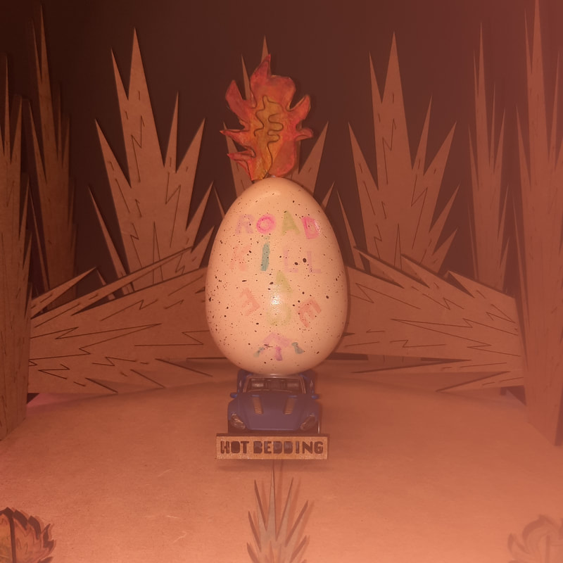
None of these photos have been edited or manipulated afterwards, it is purely photography techniques and the same goes for the final shot. In my opinion, I managed to strike a balance between hot and cold since the photo overall appears rather warm, but the colours on the egg are colder, so they stand out. This hot-cold contrast has a strong visual impact and I'm very proud of how it turned out.
My main tools:
I tried out the cling film because I didn't have any petroleum jelly, which I read somewhere a while ago about being able to produce 'blurry' photos. I wanted to experiment with as many visual effects as possible with the materials I had on hand.
The Back Cover
Here, I took full creative liberty with both the track names and the photo editing. For the 'Tracks', I used the font I created from the 2D project. I aimed for the back cover to contrast with the front, so I chose green and blue. In the end, I chose the green version despite blue being complementary to orange, because I thought the green suited the mood and genre more.
After the group critique session...
Some ideas were already churning in my mind after the feedback from the tutors, so I drew them up straightaway.

Using primarily MDF for the set, a DIY theme naturally surfaced, which was brought to my attention from a tutor. One of my first set of photos for the album cover included my hand holding the laser cut of 'HOT BEDDING', which was just a random play of perspective on my part, but they really liked this concept, which reinforced the theme of DIY. Therefore, the concept above shows a bit of exploration of this.
Several people have mentioned my ink tray (that I used for stamping) resembled blood, which would be the prime prop for a site of roadkill. It was also extremely fitting that prior to the making of this plan, the egg had accidentally slid off my box, leaving it in a cracked state. I was at a loss at first, before I discovered I could still use the egg like this.
Several people have mentioned my ink tray (that I used for stamping) resembled blood, which would be the prime prop for a site of roadkill. It was also extremely fitting that prior to the making of this plan, the egg had accidentally slid off my box, leaving it in a cracked state. I was at a loss at first, before I discovered I could still use the egg like this.