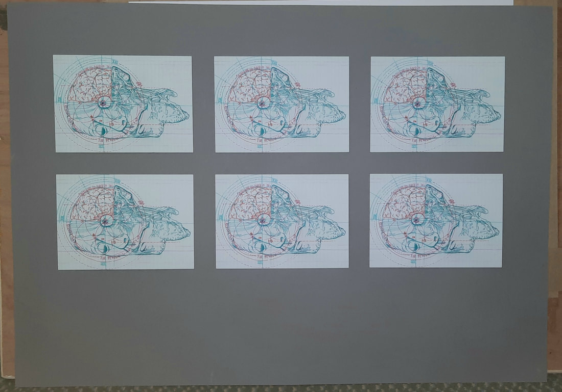
 To achieve this balance, I used masking tape and string for the equidistant post cards. I started off with the postcards in the centre and worked from there.
0 Comments
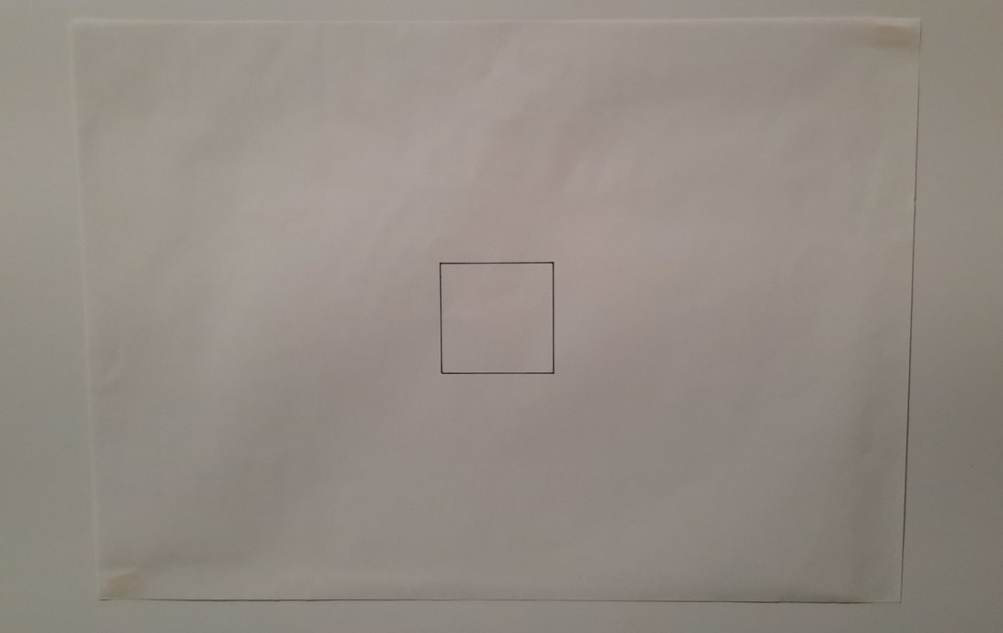 I used layout paper first to find the centre of the piece of paper and for the placement of the square.
It turns out the brief want a book made from perfect binding, which only involves glue application along the bunches of pages, before being inserted into the folded cover. I mistook it as a book that needed to be bound perfectly. The binding used here is coptic binding, which one of my peers taught me how to do.
Cutting at a 45 degree angle was extremely difficult and I was informed that I cut it an angle a lot smaller than 45 degrees, which in turn made it even harder for me. I am proud of how the bottom edge turned out and I believe bevelling definitely requires more practice if I wish to window mount my work in the future.
For the second project, I will be learning and practicing old school illustration skills. My experience in this area is minimal so I am excited to try all these tasks.
This was my first time book binding and I learnt very quickly how important it was to make sure a sharp craft knife blade was being used, especially when trimming the page creep. I had difficulty using a stapler for the saddle stitches, so I used thread instead. I chose to do a much simpler form of stab stitching than the example shown on the brief. One of my peers showed me how to stab stitch since they were well-versed with book binding. I struggled more with the square motifs inside and made a mistake early on, which impacted the measurements for the squares that followed. Next time, I will draw every square on layout paper, since that is actually quite useful for mapping out things like this.
For a better reading experience, click here! (Issuu) The main criticisms were about the clarity of the panels and the font choice due to its low legibility. I understand now that the panels do blend into the background rather well, unfortunately, but we chose more abstract-shaped panels as we thought it would suit the murky atmosphere of the foggy old town. The script font suited the time period for the setting of the story and was fine for the title, but as body text, it is admittedly not that easy to read if the reader is not already familiar with the rhyme.
|
Site powered by Weebly. Managed by 34SP.com