Papa Was a RodeoI was stuck for a while on the story and how best to represent the song lyrics, but I knew that I wanted to showcase the warm relationship and strong connection between the characters. A sunset popped into my mind as I was thinking about this, so that's why I sketched a few to see if I should use them actively in the comic. I decided it would be the most impactful for the final panel, especially with the lyrics informing us of the happy ending. It would make the moment more powerful. 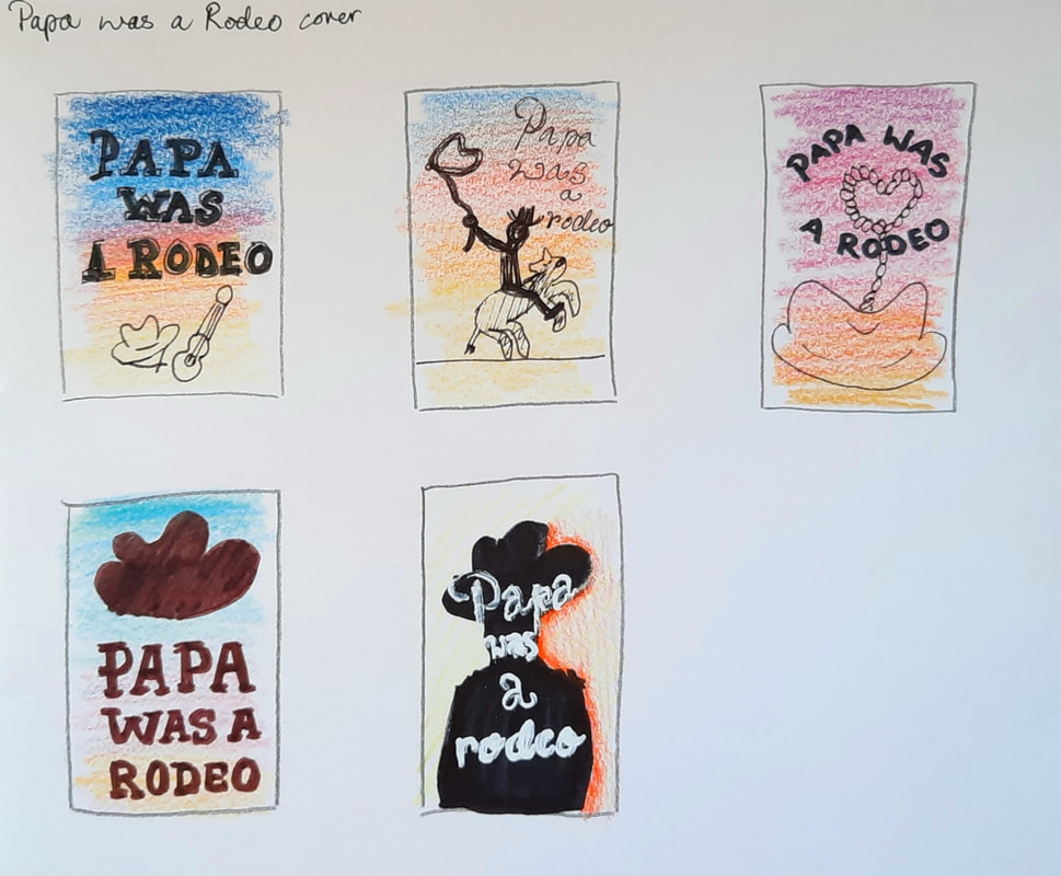 With the sunset in mind, I generated these thumbnail visuals for the cover of my comic. The Final ComicI got a lot of eye-opening feedback: the main one being - I don't have to illustrate every line! I only need to show the important parts of the narrative (i.e. the connection between the characters). Due to the repetitive format of my comic, the reader knows what to expect, leaving no surprises or impact. The reader easily becomes lost as a result. I need to stay focused on what I need to emphasise within the narrative.
0 Comments
The feedback I got was that I lost the level of detail I had with the piece inspired by Gilbert's work, compared to my pencil experimentation. To improve on my Holland piece, I should have used a bold, contrasting colour, like a hot red, in the background. This would have peered through the blues, yellows and greens in the sky.
Children's BookI wanted to keep the mixed colours visible, so I didn't blend in the sky very much. Psychological HorrorI was concerned about building layers of watercolour on this shiny paper because it doesn't stick very well to the surface, so it was in danger of being rubbed off if I was too heavy-handed with the brush. However, I managed fine in the end. Sci-fiThe different colours were visible throughout the painting, but towards the end, it became lost because of the blue spotlight against the blue sky.
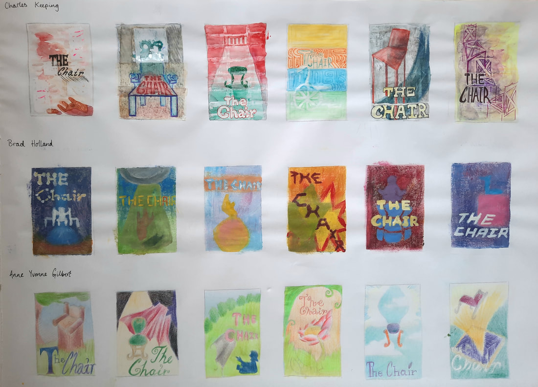 I chose Keeping's style for psychological horror, Holland's style for sci-fi and Gilbert's style for the children's book. I kept perspective and diverse chair designs in mind when forming the compositions. It was a lot to consider, but it helped me form the ideas quicker because I was able to link everything together.
|
Site powered by Weebly. Managed by 34SP.com