|
Examples of the artists' work: Anne Yvonne GilbertCharles KeepingBrad HollandMy experimentation into each artist's techniqueI noticed Anne Yvonne Gilbert does quite a bit of colour mixing with her pencils so I tried out different combinations with my own pencils to try and recreate the same effect. With Charles Keeping, I experimented with various surfaces that could restrict the watercolour and ink, but I don't think I quite got the effect. After inquiring a tutor about this, I was recommended paper with shiny surfaces, so I will be using that for the final piece. Brad Holland's minimal paint technique required a lot of scratching and patience. I tried to make the process smoother by adding a bit of water to my brush and I think it did the trick.
0 Comments
ProcessI took progress photos for the compositions I used acrylic as a primary medium for. OutcomesFrom this, I learnt that visual clichés were not something to avoid, but instead a powerful tool for communication. It's more important to be able to utilise these in clever and innovative ways.
Scale This is one of my less dynamic compositions since I was focused solely on maximum contrast with the sizes of the letters. Power I definitely struggled the most with this composition. Ironically, my Power piece had the weakest composition. I tried to show the A's were trying to fight against the powerful W, but it looks messy, and not in the good way. Playful This one was quite fun, I wanted to show playfulness without implying childishness by using this colour scheme because it felt more interesting to do so and also, it meant that I was playing around with the prompt as well. Pattern This composition is my favourite since there's just something about diagonals... Also, the idea for this came very easily. Masculine The varying levels of opacity for some letters definitely elevated the entire composition, in my opinion. It ties the foreground and background together really well. Feminine I made sure this contrasted greatly with the Masculine composition. I find the C arrangement really visually satisfying and it may be because of the contrast in stroke width.
ColourI wished the purple looked more visually appealing and harmonious with the other colours, but this was the natural result and it would be wrong to alter it. The tonal scales were difficult because I knew I was in danger of an endless cycle of repainting and shifting the tones slightly. Even though I did fall into this trap, I tried to be minimal about it. I did not have much of an issue with mixing a wide range of colours for the Communication Squares, I just wish I remembered to use tape for crisper edges.
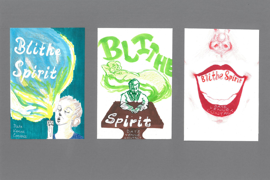 At the feedback session, it was relayed to me that there were generally too many white backgrounds in my visuals. I think, particularly for the idea in the middle, I should have chosen a medium-toned colour, somewhere in between the brown table and the green spirit. This could have been either a green-based grey to tie in with the other colours, or be a murky mix of colder shades to contrast with the foreground instead.
I agree that the coloured background has a more professional feel since it enhances the overall composition. The idea well ran dry at many points, but I am satisfied with the variety of visuals I generated. Several of my ideas were inspired by certain pivotal moments in the play. Despite the inclusion of supernatural matter and psychic powers, I stayed with vibrant and upbeat colour schemes due to the play being a light-hearted comedy. I wanted to represent both equally as I thought they were core to essence of the play.
I chose the play Blithe Spirit after reading up on the summary of the story and because I like the comedy genre. I had never heard of the play before, so I had a lot of research to do to get a feel for it all. I started by watching the play and chose the earliest version I could find online. This one happened to feature the playwright of Blithe Spirit, Noël Coward, as the main character Charles Condomine. I took some screencaps of some interesting scenes to draw from since I thought it could become inspirational material for my ideas later. I made some notes whilst I watching the play and decided to think in colour as well, hence this word wall at the end.  I thought of an idea for a possible visual, so I drew it right away. It's based on the first séance in the play, when it's still all fun and games for Charles. I then came up with an alternate typography idea, keeping with the theme of the hands. I decided to stop since it was not very legible.
I was the most eager to try out drawing people in perspective during this project so I used this helpful tutorial as a starting point. The tutor made it look a lot easier than it was. My perspective definitely needs a lot more work. I felt that it was easier with a real-life reference to study from and in the future, I should start with observationals and references if I want to do perspective drawings in more detail.
Following the lecture slides, I tried out some perspective exercises. After a while, it wasn't so hard to wrap my head around. Using different colours definitely made it less confusing.
|
Site powered by Weebly. Managed by 34SP.com