|
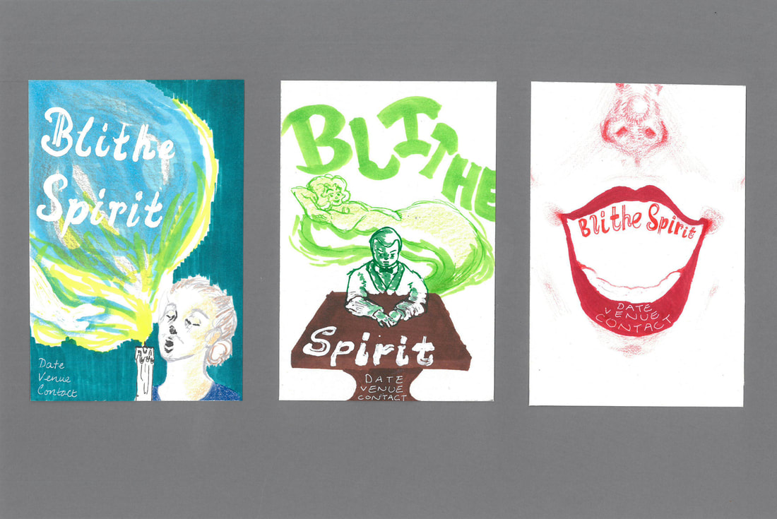
At the feedback session, it was relayed to me that there were generally too many white backgrounds in my visuals. I think, particularly for the idea in the middle, I should have chosen a medium-toned colour, somewhere in between the brown table and the green spirit. This could have been either a green-based grey to tie in with the other colours, or be a murky mix of colder shades to contrast with the foreground instead.
I agree that the coloured background has a more professional feel since it enhances the overall composition.
0 Comments
Leave a Reply. |
Archives
December 2021
Categories |

