|
The idea well ran dry at many points, but I am satisfied with the variety of visuals I generated. Several of my ideas were inspired by certain pivotal moments in the play. Despite the inclusion of supernatural matter and psychic powers, I stayed with vibrant and upbeat colour schemes due to the play being a light-hearted comedy. I wanted to represent both equally as I thought they were core to essence of the play.
0 Comments
I chose the play Blithe Spirit after reading up on the summary of the story and because I like the comedy genre. I had never heard of the play before, so I had a lot of research to do to get a feel for it all. I started by watching the play and chose the earliest version I could find online. This one happened to feature the playwright of Blithe Spirit, Noël Coward, as the main character Charles Condomine. I took some screencaps of some interesting scenes to draw from since I thought it could become inspirational material for my ideas later. I made some notes whilst I watching the play and decided to think in colour as well, hence this word wall at the end.  I thought of an idea for a possible visual, so I drew it right away. It's based on the first séance in the play, when it's still all fun and games for Charles. I then came up with an alternate typography idea, keeping with the theme of the hands. I decided to stop since it was not very legible.
I was the most eager to try out drawing people in perspective during this project so I used this helpful tutorial as a starting point. The tutor made it look a lot easier than it was. My perspective definitely needs a lot more work. I felt that it was easier with a real-life reference to study from and in the future, I should start with observationals and references if I want to do perspective drawings in more detail.
Following the lecture slides, I tried out some perspective exercises. After a while, it wasn't so hard to wrap my head around. Using different colours definitely made it less confusing.
This project is about drawing and visualising. For the first week, we start with one-point and two-point perspective. Here is an artist I follow on Twitter called Brittnie (username evergreenqveen) that utilises perspective in her work: Below are the three original artworks I will be attempting to recreate: PencilOut of the three mediums for this task, I have the most experience in pencil, but it has also been a very long time since I did a full pencil drawing like this. I was sad to see just how rusty I was. A side-by-side comparison
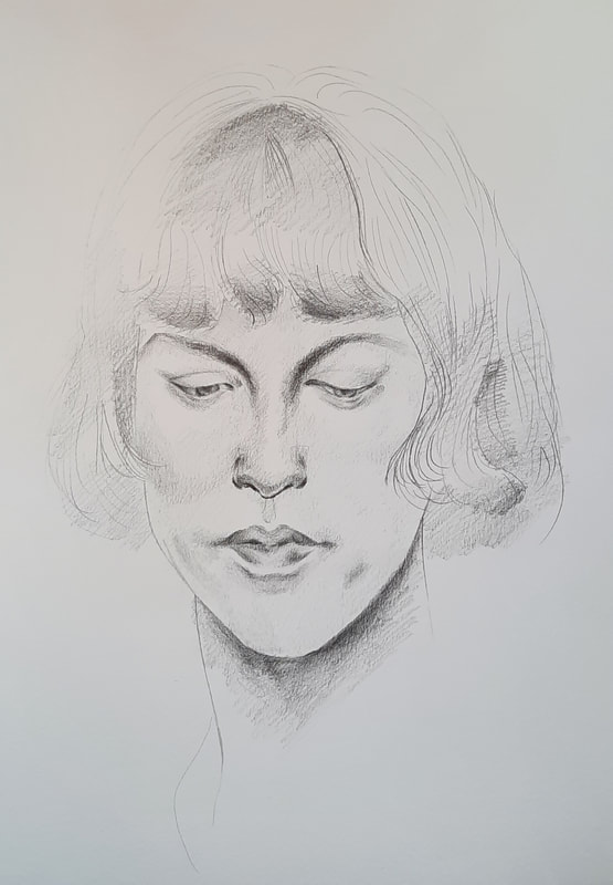
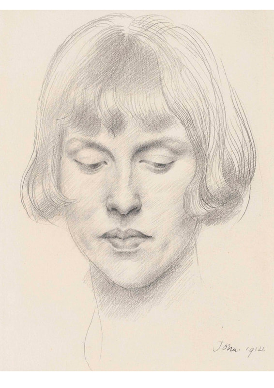
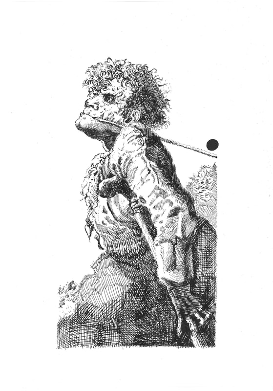
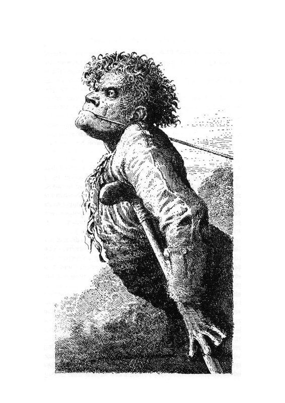
After trying out this kind of shading, I am astounded at just how light a hand Augustus John must have when doing this soft linear shading. This is definitely a lot harder to replicate than it looks. Dip pen & inkI enjoyed using dip pen and ink, but it really hurts when a splotch of ink lands on your work, especially if it happens towards the end of the piece. The level of detail you can achieve with the dip pen is incredible, but it also made me impatient towards the end because of the sheer amount of hatching lines. A side-by-side comparison
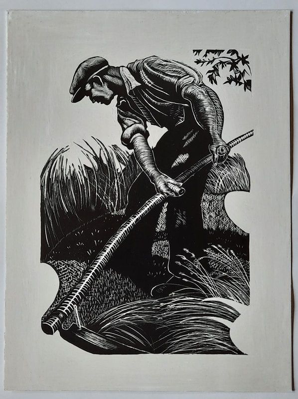
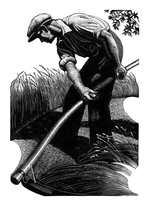
Seeing them side-by-side like this has made me realise the darkest areas need to be even more saturated with cross-hatching to reach the same tonal range as the original. I notice some of the smaller lines in the background have not been picked up by the scanner, but I am otherwise quite proud of my copy. One part I found difficult when following Peake's style of not having distinct outlines in his work was creating definition within my piece. I feel the balance between tone and contrast may be the key to this. ScraperboardAs this was my first time using scraperboard, I tested out the pressure and the best way to handle the tools for the smoothest marks before moving onto parts of the actual piece. Using a sharp tool with minimal pressure was the best way to go. This medium requires a lot of care and precision. A side-by-side comparison
This copy was definitely the most challenging for me, but I think I took a decent stab at it as it appears quite similar to the original. However, towards the end when I was scratching out the straw/wheat, it became more difficult to make light and smooth lines and I believe it was due to the decreasing sharpness of my tools.
Prototypes, practices and experiments 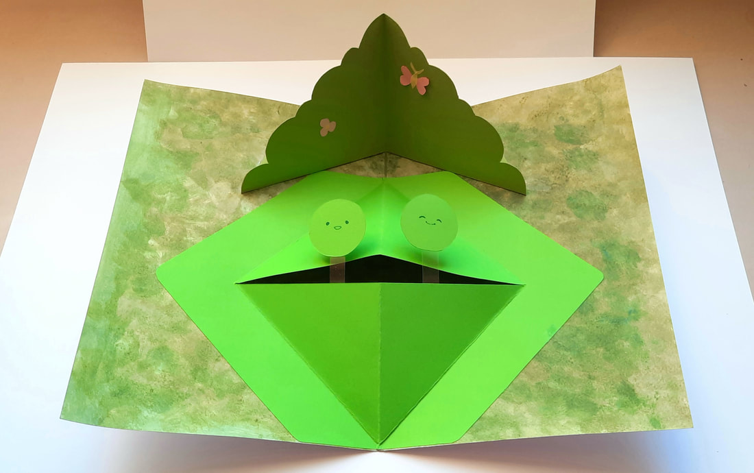 'Like two peas in a pod' To make sure the background could be distinguished from the all-green composition, I went for a textural approach, using a sponge with diluted acrylic for this natural appearance.
These are progress shots, along with some alternate ways of folding throughout the process. 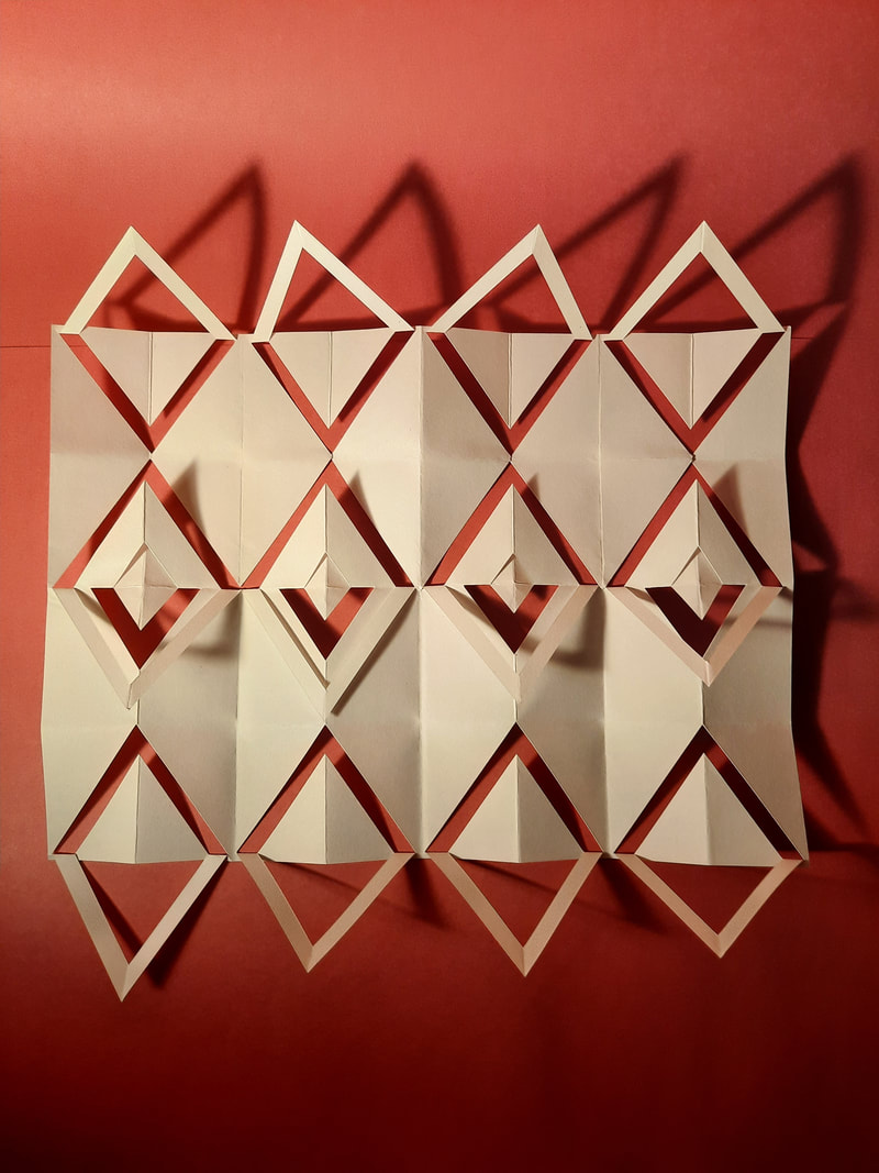 This is the final outcome. I chose the red background since that felt suitably dramatic for the photograph. I tried lighting the pattern from various angles to achieve the starkest shadows for maximum visual impact.
The letter 'R' made the cylinder feel easy. However, in my opinion, I did a decent job since it stayed intact for a while. Perhaps paper glue may have been better than double-sided tape, because for some reason, the card would not stay fully adhered to each other.
The cylinder was by far the most difficult to make. I can confidently say I made a perfect cube and pyramid, at least.
|
Site powered by Weebly. Managed by 34SP.com