|
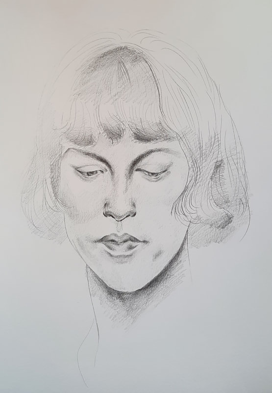
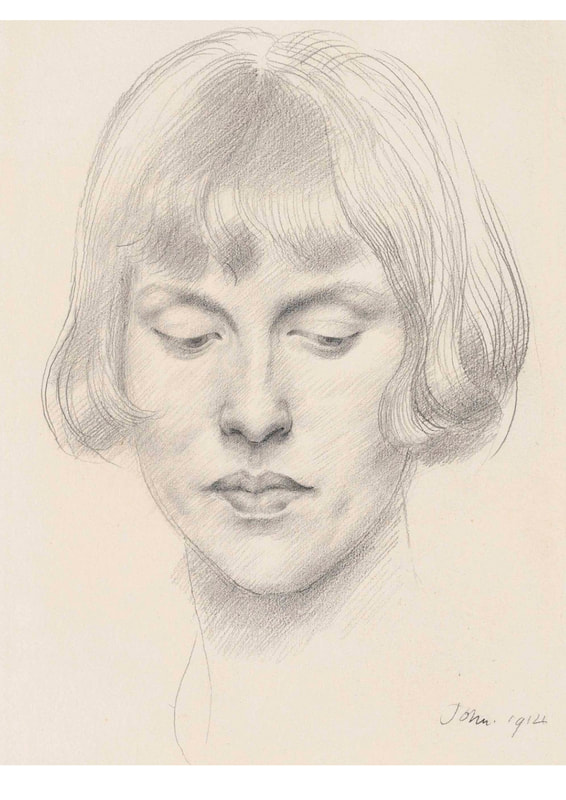
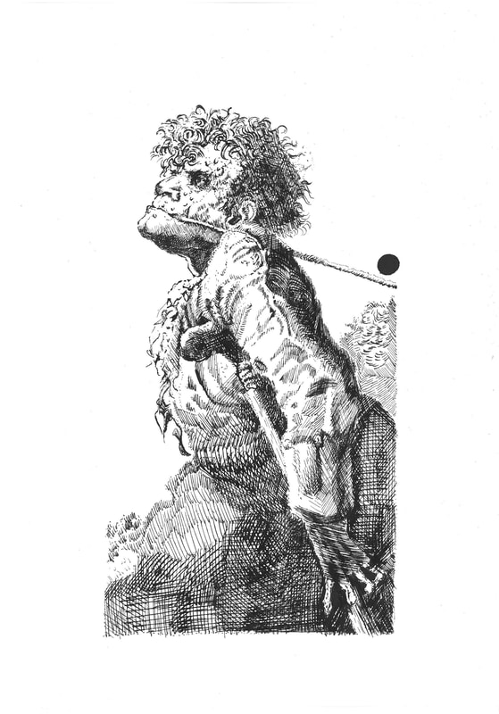
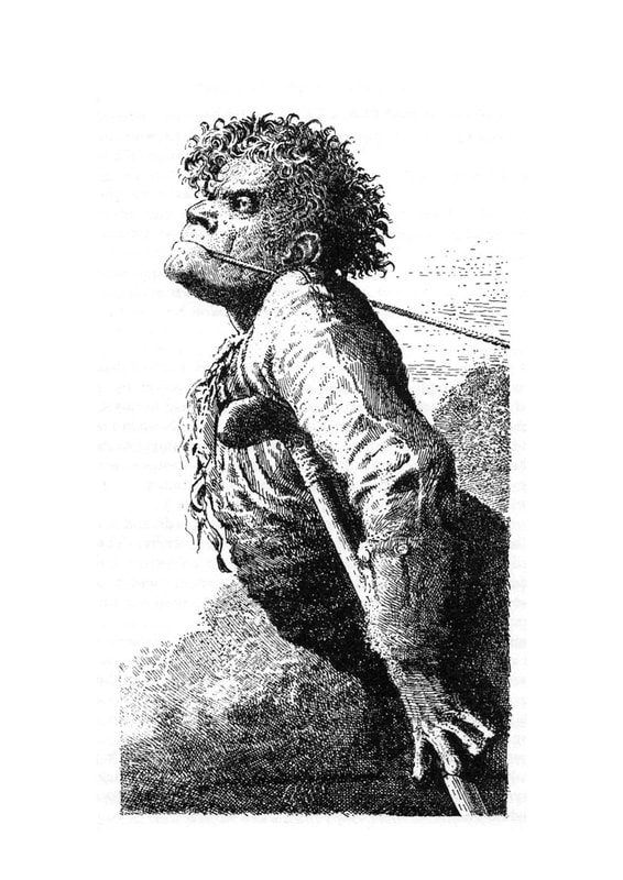
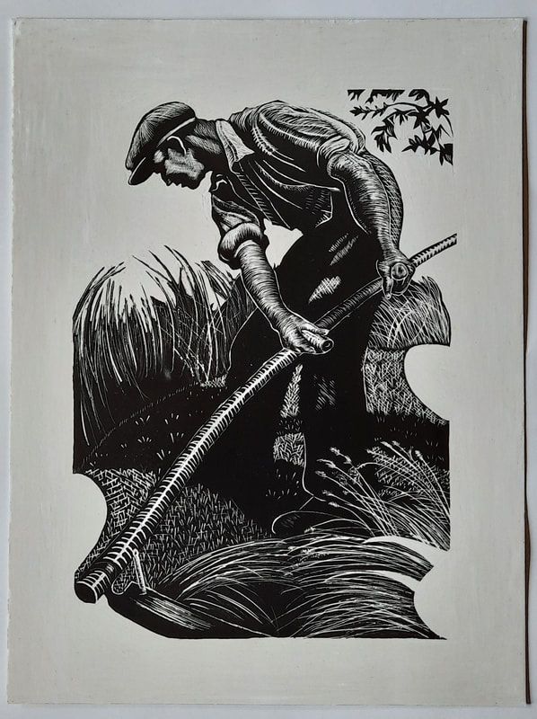
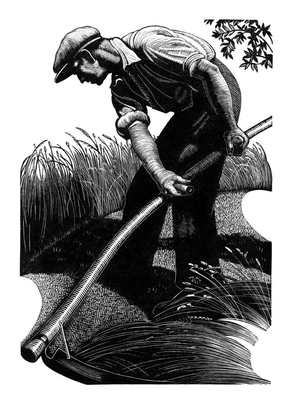
Below are the three original artworks I will be attempting to recreate: PencilOut of the three mediums for this task, I have the most experience in pencil, but it has also been a very long time since I did a full pencil drawing like this. I was sad to see just how rusty I was. A side-by-side comparison After trying out this kind of shading, I am astounded at just how light a hand Augustus John must have when doing this soft linear shading. This is definitely a lot harder to replicate than it looks. Dip pen & inkI enjoyed using dip pen and ink, but it really hurts when a splotch of ink lands on your work, especially if it happens towards the end of the piece. The level of detail you can achieve with the dip pen is incredible, but it also made me impatient towards the end because of the sheer amount of hatching lines. A side-by-side comparison Seeing them side-by-side like this has made me realise the darkest areas need to be even more saturated with cross-hatching to reach the same tonal range as the original. I notice some of the smaller lines in the background have not been picked up by the scanner, but I am otherwise quite proud of my copy. One part I found difficult when following Peake's style of not having distinct outlines in his work was creating definition within my piece. I feel the balance between tone and contrast may be the key to this. ScraperboardAs this was my first time using scraperboard, I tested out the pressure and the best way to handle the tools for the smoothest marks before moving onto parts of the actual piece. Using a sharp tool with minimal pressure was the best way to go. This medium requires a lot of care and precision. A side-by-side comparison This copy was definitely the most challenging for me, but I think I took a decent stab at it as it appears quite similar to the original. However, towards the end when I was scratching out the straw/wheat, it became more difficult to make light and smooth lines and I believe it was due to the decreasing sharpness of my tools.
0 Comments
Leave a Reply. |
Archives
December 2021
Categories |

