|
I chose to do a much simpler form of stab stitching than the example shown on the brief. One of my peers showed me how to stab stitch since they were well-versed with book binding. I struggled more with the square motifs inside and made a mistake early on, which impacted the measurements for the squares that followed. Next time, I will draw every square on layout paper, since that is actually quite useful for mapping out things like this.
0 Comments
For a better reading experience, click here! (Issuu) The main criticisms were about the clarity of the panels and the font choice due to its low legibility. I understand now that the panels do blend into the background rather well, unfortunately, but we chose more abstract-shaped panels as we thought it would suit the murky atmosphere of the foggy old town. The script font suited the time period for the setting of the story and was fine for the title, but as body text, it is admittedly not that easy to read if the reader is not already familiar with the rhyme.
I used digital watercolour and ink brushes so that I would still achieve a similar effect to the traditional experiments. The crisp edges contrast nicely with the abstract textures of the watercolour and ink.
For the panels that did not feature the characters in detail, I was in charge of the illustration. Here are the specific panels in page order. Woodland animals (a fox, badgers, a deer and a crow) were chosen for this imposing silhouette because these characters are part of the upper class in terms of wealth (and the food chain) and therefore they were the appropriate choice for bullying the impoverished and meek mouse, Tommy Tucker. The next panel represents a smug crowd of characters laughing at poor Tommy's plight. The environment is already rather foggy, so I decided to use this and transform it into this cloud of darkness to strengthen the heavy atmosphere. It means Tommy no longer sees the town and can only focus on these cruel faces surrounding him.
The third panel switches to a silhouette of Tommy because the lamppost is no longer lit. Throughout the comic, we decided that the lamppost (which is featured heavily in the comic as it is the only source of light) would gradually dim to represent Tommy's dwindling hope in his life. These silhouettes also draw focus to the grey scarf in the centre, which was his only source of warmth. The scarf versus the other animals' fully dressed appearances also highlighted how poor he was compared to them. This loss of both light, hope and warmth all contribute to the implication of his death in the end. 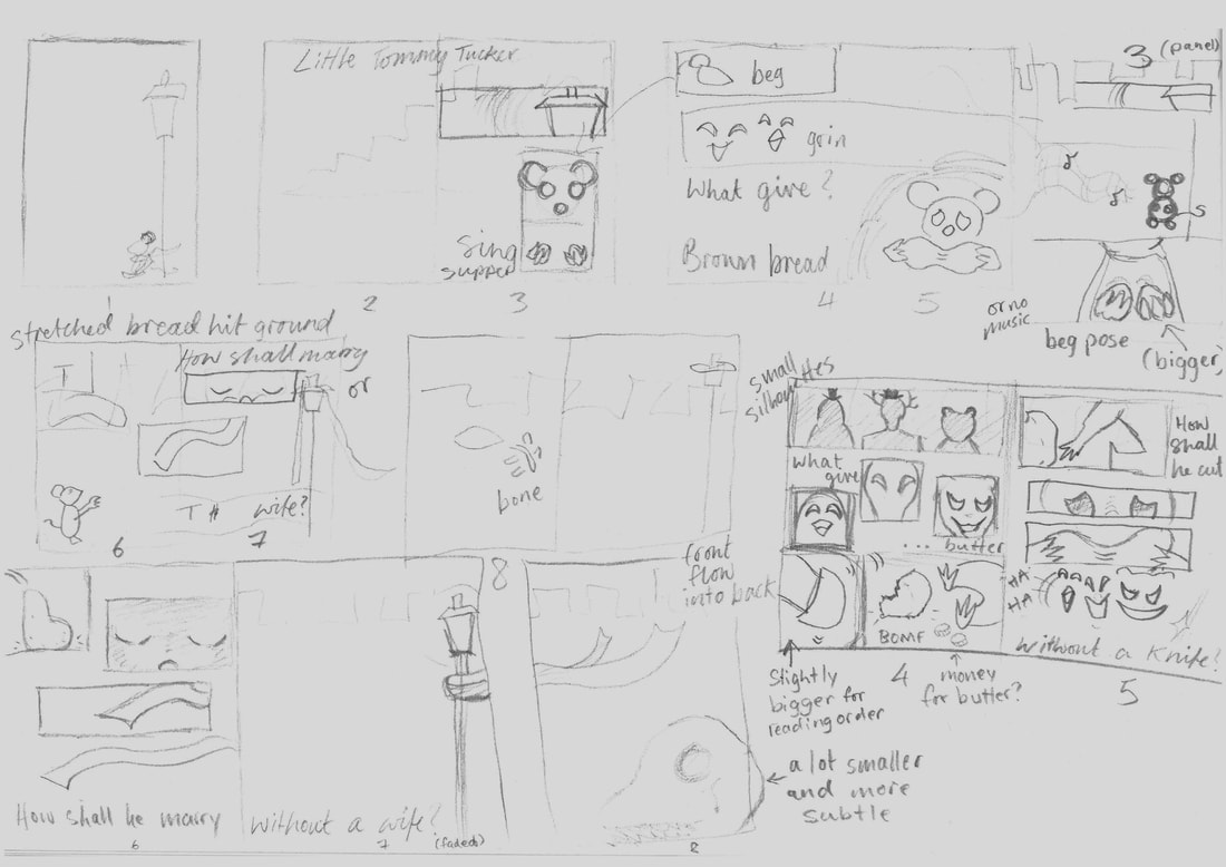 It was my first time storyboarding properly like this and mapping out the panels was helpful, but also quite stressful and difficult. The need for clever and creative ways to construct panels was overwhelming, which is probably what added to the difficulty. At this stage in the project, it may have been better if I focused more on the flow of the story, than worry about how innovative the comic was.
The aim was for more of a spooky and foggy town appearance, hence the murky colour scheme. I tried a variety of shapes with varying wonkiness because our comic was going to have a darker setting, so these backgrounds would set the mood perfectly.
After researching the meaning of the poem, I wanted to focus on this interaction and divide between the poor and the rich. As a group, we decided to show this using animals since the difference between the kinds of animals and the way we view them (predators and prey) would enhance this.
After fleshing out the setting for our comic, I went ahead and drew a potential idea for the final page of the comic, which includes the last line from the rhyme.
My group was given this nursery rhyme to base our comic on. Little Tommy Tucker sings for his supper, Click here for a mood board made together with my group (Sophie and Dennis) for the conceptualisation of the comic.
|
Site powered by Weebly. Managed by 34SP.com